Exposing Possible Campaigns with DomainCAT

(Part 1) Streamlining Adversary Infrastructure Hunting With SOAR
(Part 2) How To Build a Human Analyst’s Hunting List With SOAR Playbooks
Introduction
In Part 1 of this series, we saw how SOAR can help streamline some of the routine, repetitive enrichment and examination of potentially malicious infrastructure; in Part 2, we looked at where SOAR playbooks can tee up a set of infrastructure for a human to investigate further. In this installment, we’re going to look at another SOAR-to-human handoff, and how a new tool being open sourced by DomainTools can help when the connections across domains are elusive. My co-author for this blog is John “Turbo” Conwell of the DomainTools Security Research Team. And—fair warning—while it is the final entry in this series about SOAR, you’ll find that the vast majority of this installment focuses on what happens when the automated part leaves off.
When First Order Pivots Don’t Provide Answers
As a quick context-setter, especially for those coming straight to this installment of the series, a common form of hunting in the security operations center (SOC) is to identify potentially risky domains that have received communications from the protected environment, and then to hunt for related assets that are potentially under the same control as the starting-point domains. In this way larger attack campaigns may be able to be identified so that defensive and forensic actions are available against not just what has already been observed, but what might be lying in wait for future adversary action.
Pivoting on an IP address, name server, registration identifier, or other such object often reveals a set of domains that can reasonably be assessed to be related to each other. We saw how the number of domains sharing a common data point can be very useful in pointing toward likely connectedness. We also saw that at times, the connectedness tied to a given pivot may be somewhat ambiguous, which is where a human analyst can do a bit of exploration in DomainTools Iris to get a better orientation around the assets in view.
Sometimes, though, none of the first-order pivots shows the analyst much in the way of obvious connection. In such cases, especially when there’s the time pressure that most SOC folks face, the better part of valor is to move on to the next piece of analytical work, and let the initially-discovered domain exist as a “lone wolf,” with no action beyond potentially monitoring or blocking that domain.
If a domain is flagged as potentially risky, or is outright known to be bad, such as in a spearphishing email, then we know that someone registered that domain for malicious purposes. We also know, from the behavior of cybercriminals, that it is very unusual for them to use only one domain as part of their action against a victim. So if we assume that our initial target domain is a) definitely malicious, and b) connected to other domains, then by leaving those connections unexplored, we risk being blind to the other assets the adversary may be intending to use against us.
Finding elusive connections, then, is a worthwhile objective—if there’s a way to do it efficiently. Enter DomainCAT.
What Can the CAT Drag In?
DomainCAT is the Domain Connectivity Analysis Tool, designed by Turbo and security researcher Matthew Pahl to help tease out domain connections which aren’t obvious to a human analyst, or which are impractical to try to discover by conventional analytical methods. To demonstrate how it can help in a real-world scenario, consider the following:
We became aware of a Business Email Compromise (BEC) campaign recently which used the domains texas-gov[.]us and tn-gov[.]us. The BEC phish in question indicated an operator of some acuity; it did not look like a run-of-the-mill commodity phishing expedition. If we assume that the actor controlling it is operating a larger campaign, it’s in our interest to get the related infrastructure into view. But in the case of this domain, the first-order pivots didn’t give us a lot to go on. Here are some of the pivots Iris shows for tn-gov[.]us:
- mcdonaldservice (at)gmail.com (158 connected domains/average risk 71)
- Jeff Thomas (371/27)
- 540 Martin Ave (70/48)
- 14086347037 (125/66)
The other pivots were decidedly un-useful for a human analyst. That being the case, I’ll let Turbo take it from here to explain what DomainCAT was able to show us about this campaign.
DomainCAT: the Marvel(ous) Origin Story
When analyzing pivots during threat hunting, most people approach it from the perspective of “what can a single pivot tell you?” But often actors will set their domains up to use commodity hosting infrastructure, so the number of entities associated with a given pivot are so big they don’t really give you any useful information.
This is where DomainCAT can help. Actors make decisions around domain registration and hosting options when setting up their malicious infrastructure. These can be considered behavioral choices.
- What registrar(s) do they use?
- What TLDs do they prefer?
- What hosting provider(s) do they like?
- What TLS cert authority do they use?
All of these decisions, together, makeup part of that actor’s infrastructure tools, tactics and procedures (TTPs), and we can analyze them as a whole to look for patterns across a set of domains.
DomainCAT is a tool written in Jupyter Notebooks, a web-based interactive environment that lets you combine text, code, data, and interactive visualizations. The tool analyzes the aggregate connectivity patterns across a set of domains looking at every pivot for every domain, asking; what are the shared pivots across these domains, how many shared pivots between each domain, do they have a small pivot count or a really large one? All of these aspects are taken into consideration as it builds out a connectivity graph that models how connected all the domains in an Iris search are to each other.
So what do I mean by “connectivity graph”? Let’s work through an example to dig into this.
BEC Phishing Scheme in the CAT
When investigating the BEC campaign mentioned above, our security researcher focused on an interesting pattern. Both domains ended in “-gov.us”. This seemed fairly sketchy, as this pattern could be used to impersonate legitimate government domains.
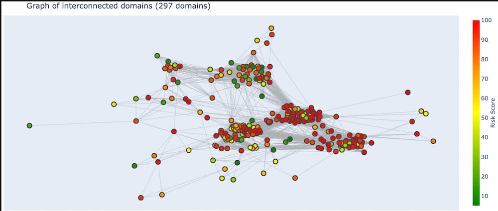
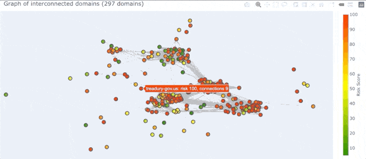
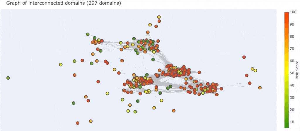
Searching Iris for domain names that end in “-gov”, with a top level domain (TLD) of “.us”, and limiting the results to domains that are 2 years old or less resulted in 297 domains. To get this list of domains from Iris into DomainCAT, just click “Advanced” and then “Export” in Iris, and copy the search hash into DomainCAT. DomainCAT will use the Iris Investigate API to query Iris for this set of domains.
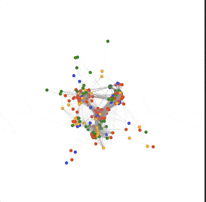
So what is a “graph” in this context? A graph is just a bunch of nodes, or circles that represent domains, connected together by edges, or gray lines that represent the pivots two domains have in common. Once DomainCAT has built this graph it can create a 2D visualization for you to explore (shown below).
Right off the bat we can see a couple of things going on. First, there seem to be 4 major clusters of domains that are grouped together. Why is this? Pairs of domains that have more pivots in common with each other will be closer together, and pairs of domains that have only one or two pivots in common will be farther apart. This layout logic will naturally cluster groups of highly connected domains together into these clusters.
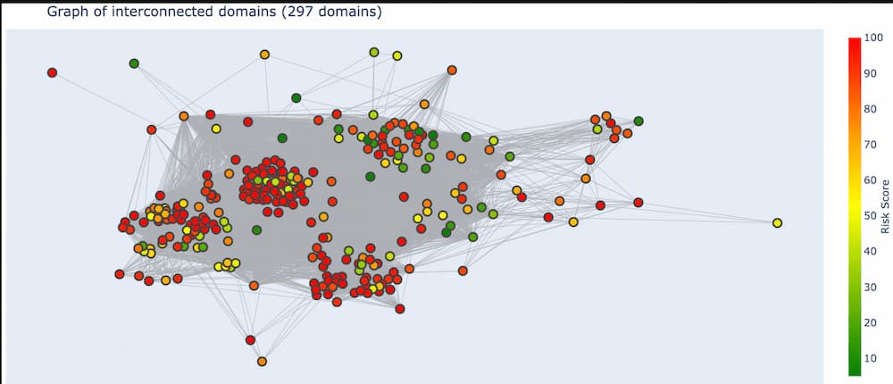
We can also see a handful of domains around the periphery of the graph. These are domains that are only connected to a few other domains and by only a few different pivots. This means these domains are not very well connected to the set of all domains. If the domain(s) we’re investigating are in this set of periphery nodes, then we know right away that our search is going in the wrong direction and we might want to go back to Iris and adjust our search criteria.
Finally, there are so many pivots in this graph, those gray lines, that it obfuscates the visualization and really makes it hard to see what’s going on, especially in the center.
Fortunately, DomainCAT also lets you explore the graph of connected domains with an interactive 3D view. You can mouse over any node and see what the domain name is and click/drag the graph to view it from different directions. This 3D view is really useful for gaining an understanding of the overall aggregate connectedness of all the domains, and if there are any clusters of domains that we might want to explore.
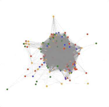
There is one problem though; there are so many edges in the graph that it’s hard to see what’s going on inside. This is because there are some pivots that belong to most of the domains in the graph, resulting in a crazy spider web egg-sac-looking thing like above. The good news is that not all pivots are as useful in every investigation, so we can remove them from the graph. For example; the search used to pull these domains together used the TLD “.us”. So every domain would have this pivot connecting it to every other domain. Luckily, DomainCAT is smart enough to look for pivots like that and automatically remove them. But there are probably other pivots that are just adding noise to the graph and do not offer much value to the investigation which we can turn off.
Turning Pivots Off
DomainCAT has a Pivot Stats view, which shows different statistics for each pivot that was found in the domains. Looking through this list, we can see that “ip_country_code” only has 7 pivots (“# of Pivots”), meaning there were only 7 different country codes found in the domains, but it’s “# of connections” shows that almost 48% of the domains are connected to each other with this pivot.
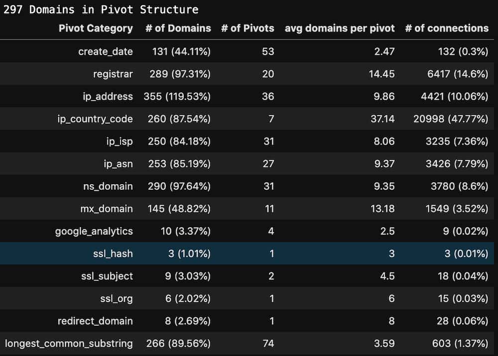
This is a good candidate pivot to turn off in the graph and should clean up the 3D view of the graph a bit. Let’s find out.
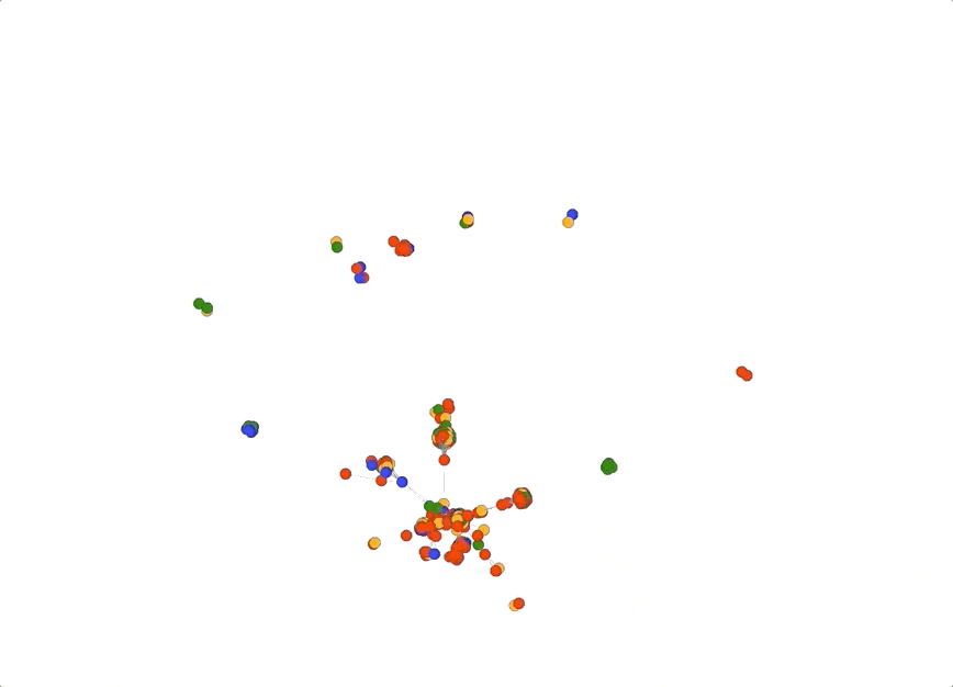
Removing a single pivot really opened up the graph! As the 3D view of the graph pivots around we can see there are four main clusters: three that seem highly connected to each other, almost in a triangle, and one fairly mixed cluster pushed farther out to the side.
Aside: Brand New Pivot!
Some might have noticed that there is a new pivot in this list that doesn’t exist in Iris called “longest_common_substring”. This is a new “local” pivot that was added into DomainCAT which compares every domain name in the search to every other domain name, and creates a pivot between two domains if they share 6 or more consecutive characters. For example, the domains visas-esta-gov[.]us and visas-estausa-gov[.]us both share the substring “visas-esta” so they would be connected in the graph. This “local” pivot acts only upon the domains already in the search set, whereas a pivot in the Iris UI can be thought of as a “global” pivot, since it shows all domains in the entire Iris database that connect to the data point in question.
In fact, you can even turn off all the pivots except “longest_common_substring” which would show how connected all the domains are based solely on how they were named. Below is an example of how powerful this type of view could be. In this graph I turned off all pivots except “ns_domain” and “longest_common_substring”. Notice how there is a central large spiky cluster; these are all domains that share a common name server infrastructure and common naming patterns. This technique can be useful when your investigation centers around domain name patterns and shared infrastructure.
Pivot Tuning
The 3D graph view looks pretty good after just turning off country code, but sometimes turning off one pivot isn’t enough. I call this process “pivot tuning;” you look at the 3D view of the graph to see if the center has opened up enough to see its internal cluster patterns. If the graph view is still too cluttered, look at pivot statistics and see if you can find another pivot that might be a good candidate to turn off. Pivots whose “# of connections” column is higher than 15% are often good candidates. Also, pivots whose “# of pivots” column is pretty low but the “# of domains” is close to 90% or greater can be helpful too. There are some pivots, like ASN or IP country code that are very coarse and apply to a high percentage of the domains. If your investigation isn’t centered around IP geo or network diversity, these pivots are also good candidates to turn off.
You’ll get a feel for what works and what doesn’t as you play with it. But keep in mind that a pivot that looks like a candidate to turn off might be critical to your investigation. For example; if the investigation is centered around domains hosted by a single ISP, turning off “ip_isp” might be a good idea, but “ip_address” might remove important connectivity information from the graph.
Exploring the Graph Details
With the 3D graph cleaned up a bit we can now dive back into the 2 dimensional view to explore the details of the different domain clusters or individual domains.
There are several things we can do in this view of the graph. We can zoom into a cluster to look at what domains are in it. A large cluster is sometimes actually made up of 2-3 smaller clusters that are useful to explore, but just lump together in the zoomed-out view. If common domain name patterns are a theme in your investigation, mousing over domains to view their name is a useful tactic.
We can also select a region of the graph (which is different from zooming in) which will select all the domains that you surround.
Once a set of domains are selected (and all other domains become grayed out) DomainCAT will show the list of domain names.
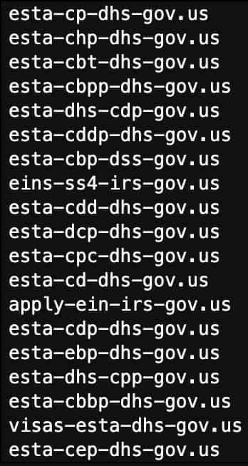
If this set of domains looks like what you are looking for in your investigation, you could export this list back into your SOAR playbook to build rules around them, or maybe add them to your firewall to block outright. Or if you could copy them back into Iris to do a more focused investigation just on these domains.
Also, once you have a set of selected domains, you can take a look at the pivots that grouped them together.
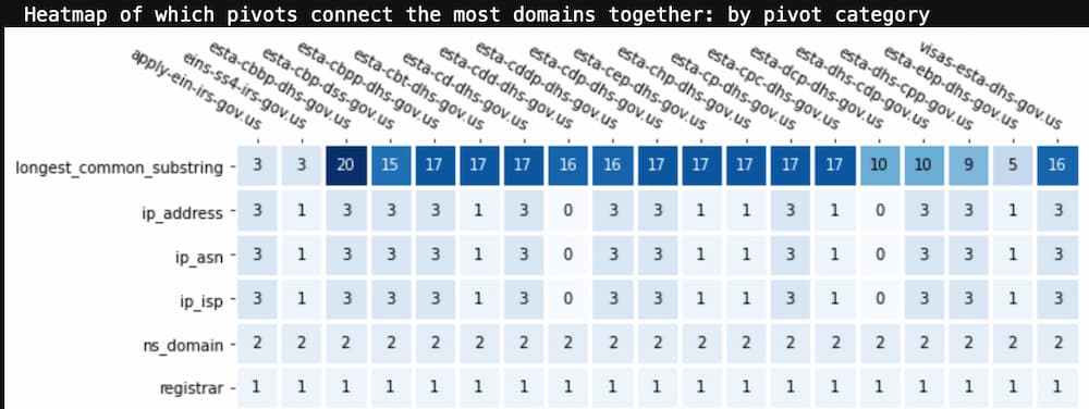
This view is a heatmap of the pivots that are shared across the selected domains, ordered by most frequent to least. Looking at the list of selected domain names, it’s not a surprise that “longest_common_substring” was the most frequent pivot. The number in each square is the total number of pivots of that type from that domain to the other selected domains. This view can tell you what pivot categories were most influential in grouping these domains together. This information can be really valuable when your investigation didn’t include one of these pivots in the original search criteria.
If you want to look at which specific pivot values are responsible for clustering these domains together, the below view is a more detailed heat map which shows the actual pivot value rather than its key.
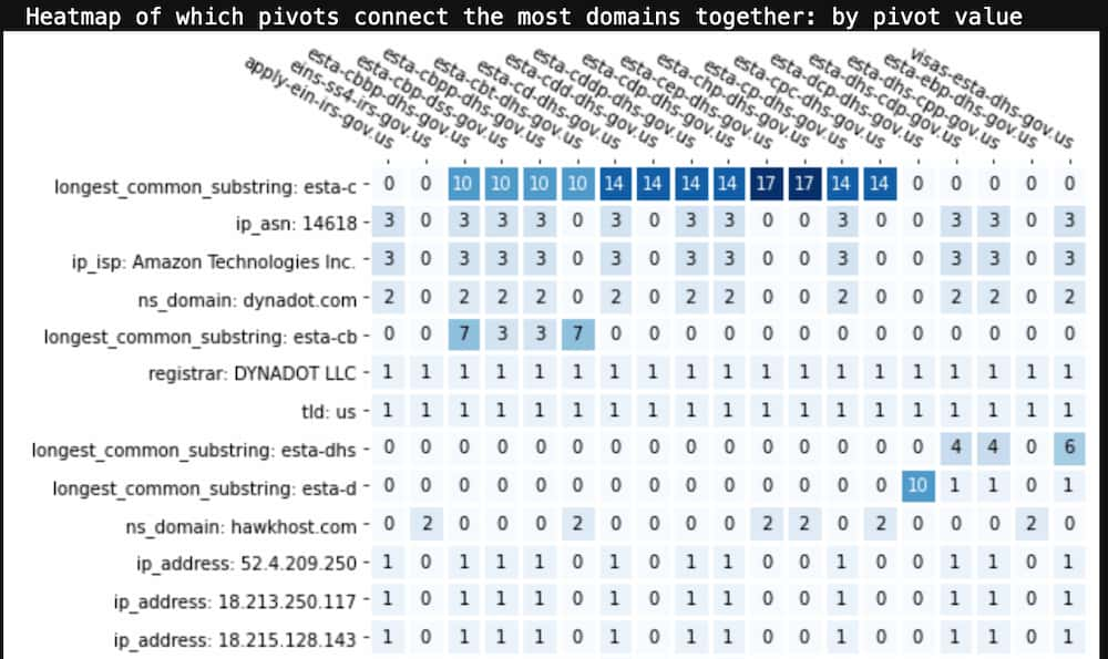
From this we can see that “esta-c” is a very common naming pattern for these domains. If this was a pattern in our source indicator(s), we might go back to Iris and add “domain contains esta-c” as an additional search criteria to bring in a broader set of domains into our investigation.
There is another interesting pattern in this view. If you look at the ASN, ISP, IP address, and dynadot[.]com name server rows you’ll see that they are all used by the same subset of domains in this list. But hawkhost[.]com nameserver is used by all the other domains. Based on the domain naming pattern it’s reasonable to believe that all these domains were created by the same actor, but it looks like this actor uses at least two different hosting and name server infrastructures. This realization could widen out the set of domains that you can now take action on.
There’s one other piece of functionality in the 2D graph view that is worth mentioning. Sometimes you just want to see what domains are connected to one specific domain. If you click any node in the graph, it will automatically select all the nodes that are connected to it and you can then explore the pivots that bind them together.
This is useful when you have a seed domain in your investigation and you want to just dive right into it and see what other domains are connected to it. Another useful scenario (shown above) is when you see a “connector domain” that sits in between two clusters but is highly connected to both. Clicking on that domain and then inspecting the shared pivots can sometimes yield valuable information about two different infrastructure patterns used by a potential actor.
Open Sourcing DomainCAT
DomainTools is planning on releasing DomainCAT as open source in the next few weeks. The project includes a Docker config file so you can just build the container in Docker and launch Jupyter Notebooks. It uses the Iris Investigate API, so any DomainTools customer with an API key can make use of it.
You can access DomainCAT on github: https://github.com/DomainTools/DomainCAT/
Wrap Up
We acknowledge that this installment of the series really isn’t too heavy on SOAR, but it’s valuable to understand where and how the handoffs between automated processes and human processes in the SOC occur. And we also wanted to illustrate how, as powerful as it is, Iris doesn’t always show immediate answers for some kinds of queries—and yet, within its dataset, the answers do exist. DomainCAT can help you unlock those answers. We hope that once it’s released, you’ll find DomainCAT an interesting tool to add to the kit. Any analyst knows that no two investigations are exactly alike, so having a variety of resources available can make a big difference in your operations.
Read more from DomainTools