Analyzing DNSDB Volume-Over-Time Time Series Data With R and ggplot2 Graphics (Part Three of a Three-Part Series)


1. Introduction
In Part One of this blog series, “Finding Top FQDNs Per Day in DNSDB Export MTBL Files”, we looked at how you can:
- Extract fully qualified domain names (FQDNs) and/or effective 2nd-level domains from DNSDB Export MTBL files
- Process that data with Perl to find the top FQDNs (and/or top effective 2nd-level domains)
In Part Two of this series, “Volume-Over-Time Data From DNSDB Export MTBL Files” our focus shifted to:
- Looking at how DNSDB count/volume-over-time data can be accessed and visualized, including how DNSDB Export customers can use
Perland
GNUplot
- to graph volume-over-time data.
- We also dug into a couple of particularly busy
k12.az.us domainsthat had been identified in Part One.
Now, in Part Three, the final article of the series, we’re going to show you how you can:
ggplot2
- to load and graph the time series data we saved to text files in Part Two.
Our first task is to get
R
installed. BEFORE INSTALLING
R
, be SURE your Mac is patched up-to-date and fully backed up!
2. Three Approaches To Installing R On Your Mac
- Install
R
- from the Comprehensive
R
R
- binaries on Mac OS X can be found here.
- To install from source, visit here.
- Official build instructions for installing
R
- from source on Mac OS X can be found here.
- EITHER WAY, you will likely need to satisfy some dependencies. In our experience, it can take a significant amount of time to do so, but installing from CRAN is still obviously a very mainstream route to install
R
- .
- KEY TIP: Be sure your default path is sane! The path I used was:
$ `export PATH="/usr/bin:/bin:/usr/sbin:/sbin:/usr/local/bin"`
- Install
R(andRStudio) with brewIf you want to try installingRthe “easy way,” you can try using the homebrew package manager. InstallingR(andRStudio) via brew requires that you’ve already installed:- The brew package manager itself
- The Apple XCode command line tools package
- The macOS_SDK_headers (these need to be installed IF you’re running Mac OS10.14.x, aka Mojave).
Rwith brew should basically involve doing:$brew install r
$brew cask install rstudio - Finally, if you like running the absolute latest code, you can also install a daily snapshot (“development”) version of
R
- from here.
When you’re done installing
R
, whichever approach you choose, you should be able to successfully check the version:
$ r --versionR version 3.5.3 (2019-03-11) -- "Great Truth"
Copyright (C) 2019 The R Foundation for Statistical Computing
Platform: x86_64-apple-darwin18.2.0 (64-bit)R is free software and comes with ABSOLUTELY NO WARRANTY.
You are welcome to redistribute it under the terms of the
GNU General Public License versions 2 or 3.
For more information about these matters see
http://www.gnu.org/licenses/.
[snip]
3. Documentation
Even if you normally aren’t a “documentation person,”
R
is complex enough that it may eventually change your mind. There are some excellent printed books for
R
; check Amazon or your favorite local independent bookseller.
You should also check out the online documentation and the FAQ.
And then there’s help within
R
itself — try
help()
in the command line version of
R
or see the help options in
R.app
or
Rstudio
.
4. Tailoring Your R Setup
R
gives the user significant flexibility when it comes to setting up how
R
runs by default. Part of this is done via “dot” files. My
R
dot files look like the following (your preferences/mileage may vary):
(define default repository to use; don’t bug me to save when quitting)
~/.Rprofile
sys.setenv(TZ='GMT')
options(repos=c("https://ftp.osuosl.org/pub/cran/"))
utils::assignInNamespace(
  "q",
  function(save = "no", status = 0, runLast = TRUE)
  {
    .Internal(quit(save, status, runLast))
  },
  "base"
)
(define some environment variables)
~/.Renviron
TZ="GMT"
R_LIBS=/usr/local/lib/R
R_LIBS_USER=/usr/local/lib/R/3.3/site-library/
~/.R/makevars
CC=/usr/local/opt/llvm/bin/clang
CXX=/usr/local/opt/llvm/bin/clang++
CFLAGS=-g -O3 -Wall -pedantic -std=gnu99 -mtune=native -pipe
CXXFLAGS=-g -O3 -Wall -pedantic -std=c++11 -mtune=native -pipe
LDFLAGS=-L/usr/local/opt/gettext/lib -L/usr/local/opt/llvm/lib -Wl,-rpath,/usr/local/opt/llvm/lib
CPPFLAGS=-I/usr/local/opt/gettext/include -I/usr/local/opt/llvm/include
# Disable OpenMP
SHLIB_OPENMP_CFLAGS   =
SHLIB_OPENMP_CXXFLAGS =
SHLIB_OPENMP_FCFLAGS  =
SHLIB_OPENMP_FFLAGS   =
MAIN_LDFLAGS          =
5. Installing R Packages
R
is a heavily extensible language. Those extensions are often included by loading “packages.” To install the packages we need for the examples shown in this article, you’d do:
$ r
install.packages(c("ggplot2","scales"))
q()
You should only need to install these packages once.
If you have problems compiling any
R
package from source, please confirm that your default PATH is sane.
6. Running R Non-Interactively
Because we often run large jobs, and want to have easy repeatability, we often run
R
non-interactively, rather than working interactively in
R.app
or
Rstudio
. To run
R
jobs non-interactively, use vi or your favorite editor to create a file called
samplerun.R
The first line of the file should be:
#!/usr/local/bin/Rscript
Your
R
commands go into the file after that line.
We’ll use the
commandArgs
command to pick up an input file name and an output file name from the command line. We’ll use those filenames to “read from” and “write to:”
args <- commandArgs(trailingOnly = TRUE)

filename <- args[1]
mydata <- read.table(file = filename, header = FALSE, sep = " ")
colnames(mydata) <- c("date", "count","ma14")
mydata$date <- as.Date(as.character(mydata$date), format = "%Y%m%d", tz = "UTC")

outputfile <- args[2]
sink(file = outputfile, append = FALSE, type = c("output", "message"), split = FALSE)
We’ll use
R
‘s tail command print out the last half dozen observations just to make sure we’ve read in the data okay:
tail (mydata, n=6)
Now let’s declare where our graphics output goes. We’ll send our graphic output (in PDF format) to the same name as our text output file, but with .pdf appended to the name:
graphfile <- paste(outputfile, ".pdf", sep = "", collapse = NULL)
pdf(graphfile, width = 10, height = 7.5)
Finally, let’s see what our data looks like when plotted. We’ll load the libraries we need:
library("ggplot2")
library("scales")
We’ll then define the date points we want to have for the X axis:
mydatebreaks = as.Date(c("2016-07-01","2016-10-01",
               "2017-01-01","2017-04-01","2017-07-01","2017-10-01",
               "2018-01-01","2018-04-01","2018-07-01","2018-10-01",
               "2019-01-01"))
And we’ll define a title… we include a few extra newlines at the beginning of the title to provide a little extra top margin:
mytitle <- paste("\n\n", filename, "\nCounts Over Time", sep = "")
Now we come to the “guts” of the plot command.
ggplot2
works by creating a plot and then adding successive features to it. For example, in the plot commands shown below, you can see:
- the plot being instantiated (
ggplot()) - an (X, Y) data series being drawn as points
- another (X,Y) data series being drawn as line segments
- setting the title and the x and y axis labels
- definition of the scales for the X and Y axes
- printing the plot object (“p”) we’ve built
p <- ggplot()+
     geom_point(aes(x = mydata$date, y = mydata$count)) +
     geom_line (aes(x = mydata$date, y = mydata$ma14 )) +
     labs(title=mytitle,
       x = "Date\n\n",
       y = "\n\nCounts") +
     scale_x_date(limits = as.Date(c("2016-06-30", "2018-12-31")),
         breaks = mydatebreaks,
         date_minor_breaks = "1 month",
         date_labels = "%m/%y") +
     scale_y_continuous(labels = comma,
         sec.axis = sec_axis(trans=~., name="\n\n", breaks=NULL))
print(p)
We’ll make sure our command file is executable:
$ chmod a+rx samplerun.`R`
We’re then ready to run our first
R
job.
Assuming our data file is called
laveeneld.k12.az.us.201812282049.txt
and we want our output to go to
laveeneld.k12.az.us.201812282049.output
we’d say (the following is all just one long line):
$ ./samplerun.R laveeneld.k12.az.us.201812282049.txt laveeneld.k12.az.us.201812282049.output
When that program runs you may see the somewhat cryptic message:
Warning message:
Removed 13 rows containing missing values (geom_path).
That message isn’t a cause for concern.
When your
R
job finishes running, you should end up with a text output file called
laveeneld.k12.az.us.201812282049.output
:
$ more laveeneld.k12.az.us.201812282049.output:
          date count     ma14
902 2018-12-20 1225552 1205294
903 2018-12-21 1104775 1203190
904 2018-12-22 1085103 1202750
905 2018-12-23 1264038 1174670
906 2018-12-24  948697 1166914
907 2018-12-25 1107431 1168449
And you should also see a PDF graph called
laveeneld.k12.az.us.201812282049.output.pdf
that looks like:
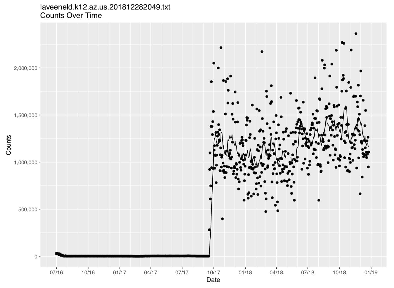
Figure 1. Laveeneld.k12.az.us plot (on regular linear axes)
7. Making Some Changes and Rerunning
Because of the wide range of count values, it’s hard to see what’s going on in that graph, particularly on the left hand side of the graph. Let’s see how that data looks when plotted on log-linear axes. We can easily add a new plot to our job and rerun it… let’s add (at the bottom of
samplerun.R
):
logbreaks <- 10^(-10:11)
logminor_breaks <- rep(1:9, 21)*(10^rep(-10:10, each=9))

mytitle <- paste("\n\n",filename, "\nCounts Over Time (log linear axes)",
    sep = "")

p2 <- ggplot() +
    geom_point(aes(x = mydata$date, y = mydata$count)) +
    geom_line (aes(x = mydata$date, y = mydata$ma14 )) +
    labs(title = mytitle,
    x = "Date\n\n",
    y = "\n\nCounts") +
    scale_x_date(limits = as.Date(c("2016-06-30", "2018-12-31")),
                 breaks = mydatebreaks,
                 date_minor_breaks = "1 month",
                 date_labels = "%m/%y") +
    coord_trans(y = "log10") +
    scale_y_continuous(labels = comma,
    breaks = logbreaks, minor_breaks = logminor_breaks,
    sec.axis = sec_axis(trans=~., name="\n\n", breaks=NULL))

print(p2)
We rerun our
R
program by hitting up arrow until we come back to our previous command, and then hitting return:
$ ./samplerun.R laveeneld.k12.az.us.201812282049.txt laveeneld.k12.az.us.201812282049.output
We then get the same output we had before, plus a new graph on log linear axes:
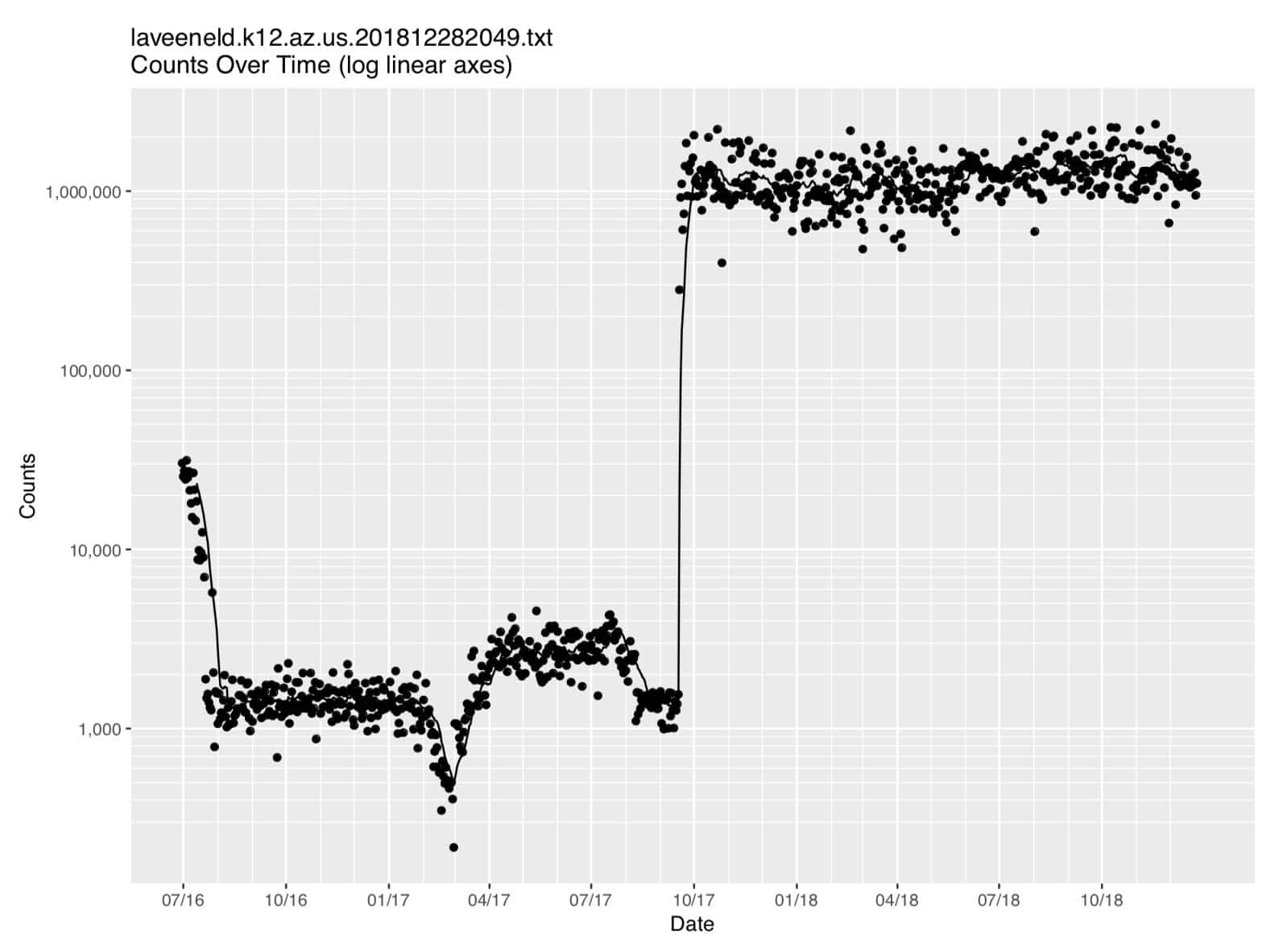
Figure 2. Laveeneld.k12.az.us data (on log linear axes)
8. Looking At The First Difference of the Data
Time series data tends to be “strongly autocorrelated,” e.g., the value of the current observation may strongly correlate with the value of the immediately preceding observation. To remove that autocorrelation, it can sometimes be helpful to take the first difference of the data. In
R
we can compute the first difference by saying:
# find the first difference (count(t)=count(t)-count(t-1))
diffc <- diff(mydata$count)

# add a new column to the table
mydata$diffcount <- NA

# now load the differences into the table, offset downward by one
rows=(dim(mydata)[1])-1
for (i in 1:rows) { mydata$diffcount[[i+1]]=diffc[[i]] }

mytitle <- paste("\n\n",filename, "\nDIFF(Counts) Over Time")

p3 <- ggplot (mydata, aes(x = date, y = diffcount, na.rm=TRUE)) +
    geom_point() +
    labs(title = mytitle,
    x = "Date\n\n",
    y = "\n\nCounts") +
    scale_x_date(limits = as.Date(c("2016-06-30", "2018-12-31")),
                 breaks = mydatebreaks,
                 date_minor_breaks = "1 month",
                 date_labels = "%m/%y") +
    scale_y_continuous(labels = comma,
        sec.axis = sec_axis(trans=~., name="\n\n", breaks=NULL))

print(p3)
We can then rerun our program. After rerunning our program, we get all our previous output, plus now a third graph:
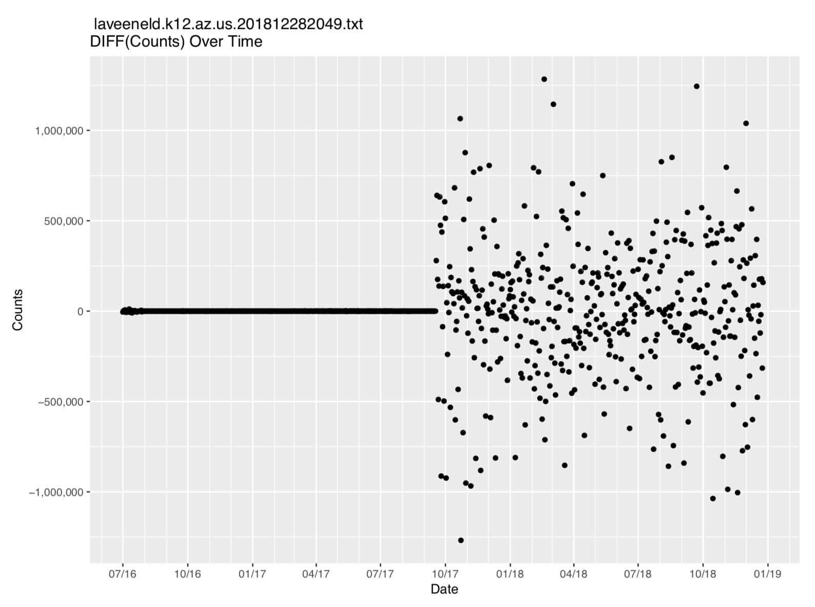
Figure 3. First Difference of The Count Data
10. Conclusion
You’ve now seen how you can install
R
and use it to read in, plot and manipulate MTBL time series data that had been output during Part Two of this series.
11. Want to Learn More About Farsight Products and Services?
Please contact Farsight Security® at [email protected].
Appendix I. R Source Code for samplerun.R
 #!/usr/local/bin/Rscript

args <- commandArgs(trailingOnly = TRUE)

filename <- args[1]
mydata <- read.table(file = filename, header = FALSE, sep = " ")
colnames(mydata) <- c("date", "count","ma14")
mydata$date <- as.Date(as.character(mydata$date), format = "%Y%m%d", tz = "UTC")

outputfile <- args[2]
sink(file = outputfile, append = FALSE, type = c("output", "message"), split = FALSE)

tail (mydata, n=6)

graphfile <- paste(outputfile, ".pdf", sep = "", collapse = NULL)
pdf(graphfile, width = 10, height = 7.5)

library("ggplot2")
library("scales")

mydatebreaks = as.Date(c("2016-07-01","2016-10-01",
               "2017-01-01","2017-04-01","2017-07-01","2017-10-01",
               "2018-01-01","2018-04-01","2018-07-01","2018-10-01",
               "2019-01-01"))
mytitle <- paste("\n\n", filename, "\nCounts Over Time", sep = "")
p <- ggplot()+
     geom_point(aes(x = mydata$date, y = mydata$count)) +
     geom_line (aes(x = mydata$date, y = mydata$ma14 )) +
     labs(title=mytitle,
     x = "Date\n\n",
     y = "\n\nCounts") +
     scale_x_date(limits = as.Date(c("2016-06-30", "2018-12-31")),
         breaks = mydatebreaks,
         date_minor_breaks = "1 month",
         date_labels = "%m/%y") +
     scale_y_continuous(labels = comma,
         sec.axis = sec_axis(trans=~., name="\n\n", breaks=NULL))
print(p)

logbreaks <- 10^(-10:11)
logminor_breaks <- rep(1:9, 21)*(10^rep(-10:10, each=9))
mytitle <- paste("\n\n",filename, "\nCounts Over Time (log linear axes)",
    sep = "")
p2 <- ggplot() +
    geom_point(aes(x = mydata$date, y = mydata$count)) +
    geom_line (aes(x = mydata$date, y = mydata$ma14 )) +
    labs(title = mytitle,
    x = "Date\n\n",
    y = "\n\nCounts") +
    scale_x_date(limits = as.Date(c("2016-06-30", "2018-12-31")),
                 breaks = mydatebreaks,
                 date_minor_breaks = "1 month",
                 date_labels = "%m/%y") +
    coord_trans(y = "log10") +
    scale_y_continuous(labels = comma,
    breaks = logbreaks, minor_breaks = logminor_breaks,
    sec.axis = sec_axis(trans=~., name="\n\n", breaks=NULL))
print(p2)

 # find the first difference (count(t)=count(t)-count(t-1))
diffc <- diff(mydata$count)

 # add the new column to the data frame
mydata$diffcount  <- NA

 # now load the differences into the table, offset by one
rows=(dim(mydata)[1])-1
for (i in 1:rows) { mydata$diffcount[[i+1]]=diffc[[i]] }

mytitle <- paste("\n\n",filename, "\nDIFF(Counts) Over Time")
p3 <- ggplot(mydata, aes(x = date, y = diffcount, na.rm=TRUE)) +
    geom_point() +
    labs(title = mytitle,
    x = "Date\n\n",
    y = "\n\nCounts") +
    scale_x_date(limits = as.Date(c("2016-06-30", "2018-12-31")),
                 breaks = mydatebreaks,
                 date_minor_breaks = "1 month",
                 date_labels = "%m/%y") +
    scale_y_continuous(labels = comma,
        sec.axis = sec_axis(trans=~., name="\n\n", breaks=NULL))
print(p3)
Joe St Sauver Ph.D. is a Distinguished Scientist with Farsight Security®, Inc.
Read more from DomainTools