Using DomainTools Threat Profile to Identify Risky TLDs


Note: The source code for this analysis can be found in the DomainTools GitHub repo here.
In the beginning there were six top level domains (TLDs). Ok, technically seven, but for our purposes here in-addr.arpa doesn’t matter. Unless you were a government (.GOV), military (.MIL), or educational institution (.EDU), there were only three TLDs you could register domains in, .COM, .NET, and .ORG. Then ICANN added .BIZ and later allowed countries to create and maintain their own top level domains (ccTLDs). More time passed, and ICANN decided to allow organizations to create and maintain their own TLDs (gTLDs). As a result, there was a vast proliferation of TLDs.
That is, of course, a gross oversimplification of the history of how we got all the TLDs we have today. But this article isn’t trying to be an accurate history of how TLDs came to be. Instead, we want to look at a different question; are certain TLDs more malicious or risky than others? We can all probably name one or two sketchy TLDs, like .TK, but are there others we should also be aware of? This very question prompted a Hack Days project with our data science and technical operations teams. The goal of this project was to see if machine learning analysis could give us more insight into the riskiness of TLDs.
There are two ways to go about specifying the riskiness of a TLD. First, you count the total number of risky domains in the TLD. But this can be misleading because large TLDs like .COM will score very high with this metric, yet that doesn’t mean they are risky as a whole. A second way is to calculate the proportion of risky domains in the TLD relative to the total count of domains. This gives you a ratio that measures the overall riskiness of a TLD. This analysis will be based on the second approach.
The next question needing to be answered is how to specify the riskiness of a domain.
Similar TLD analyses have been done based on domains being added to industry blocklists, but this approach has a drawback. For a domain to be added to an industry blocklist, there has to be some observed malicious behavior (with the noted exception of domain names that follow a cracked DGA). This means you can only specify a domain as risky after it’s been weaponized and used.
DomainTools Threat Profile
For this analysis we’ll be using DomainTools Threat Profile to specify a domain’s riskiness. Threat Profile was developed by analyzing data from over 300 million domains in our database to create a set of 3 machine learning algorithms to predict how likely a domain was created for malware, phishing, or spam purposes. It offers security professionals a view into the mindset of threat actors; how they set up their malicious infrastructure, how they determine which domain names to register, and which TLD to use.
Together, these algorithms provide a way to measure how risky a domain is before it has been weaponized by assigning each domain a score between zero and 100; zero being not risky at all, and 100 being our highest confidence that the domain was created for malicious purposes. Generally, we say a score of 70 or higher is risky, but you can adjust this based on your risk tolerance.
Threat Profile gives us three different ways to analyze the risky nature a TLD; how much a TLD is used in Phishing campaigns, how much it’s used for Malware C2 and binary delivery, and how much it’s used for delivering Spam.
Note: Threat Profile only scores domains 28 months old or younger so any TLD domain counts shown below are based on that age filter.
Distributions!
Using Threat Profile scores gives us an added benefit when analyzing TLD riskiness over industry blocklists. Since a domain is either on an industry blocklist or not, the only measure you can come up with is a simple ratio of domains in the TLD that are blocklisted. But this doesn’t give you any descriptive information about the risky nature of a TLD.
With Threat Profile we can count the number of domains in a TLD that have each value; i.e., how many domains have a score of 0, 1, 2, etc. Put these counts together and you now have a distribution profiling the riskiness of a TLD. The benefit of this is it gives us a much more nuanced description of riskiness than a simple ratio.
What is a distribution? It’s just a statistical way of showing all the possible values for something and how often they occur. For example, look at the distribution of Threat Profile Phish scores for .COM.
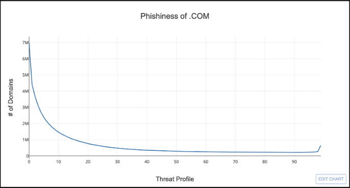
The x-axis is all the possible values for Threat Profile’s phish score from zero to 100, and the y-axis is the count of domains in .COM that have a given score.
So what does this distribution tells us? Well, if you look at the left side of the chart, you can see that the majority of domains in .COM have a Threat Profile phish score less than 25; not very phishy. On the right side there is a bit of an uptick in domains around 98, but overall it doesn’t look very risky.
You can also use distributions to compare TLDs. For example, take a look at .COM compared to .TK.
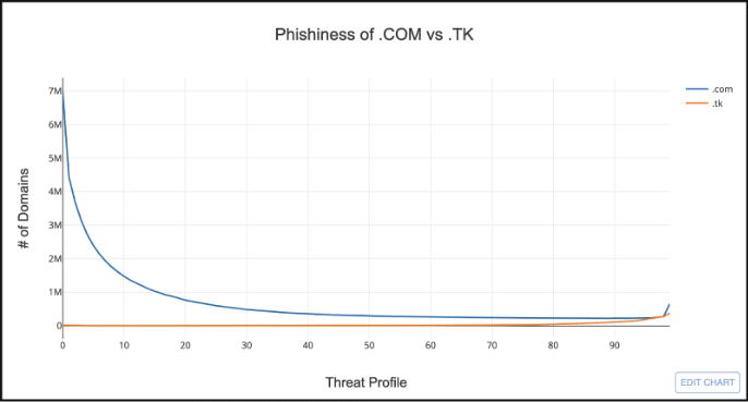
Hmmm…this doesn’t look very useful. It’s hard to visually compare TLDs that have drastically different domain counts. But we can solve this by normalizing the distributions by calculating the ratio of the number of domains for each score by the total count of domains in the TLD. This is called a probability distribution.
Below is the exact same information, but now normalized.
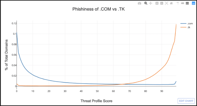
This makes it much easier to compare the riskiness of two TLDs. The x-axis is still the same, but the y-axis is now the proportion of domains that have a given Threat Profile score.
This chart dramatically demonstrates the risky nature of .TK relative to .COM. The two distributions are almost mirror opposites of each other, where the majority of domains in .TK have a Threat Profile score greater than 70.
Analyzing All the Things (or TLDs)
Graphing Threat Profile distributions makes it easy to visually compare a couple TLDs, but not when you have hundreds to look at. To analyze all the TLDs we can use a type of machine learning analysis called Clustering to group TLDs together that have a similar distribution.
Clustering is a class of machine learning algorithms called Unsupervised Learning. It’s called Unsupervised Learning because the algorithm draws inferences from the data without human guidance. Clustering is an algorithm that tries to group data together based on how similar the data is. In our example, we’ll be grouping TLDs together based on the shape of their normalized Threat Profile distributions.
The first thing to do is decide how many clusters we want to end up with. I filtered the TLDs down to only those that have more than 5,000 domains, which leaves us with 499 TLDs. A good rule of thumb is the square-root of the number of items you want to cluster, which gives us 22.3. I rounded this down to 20 just for a nice round number.
When we cluster the TLDs together the algorithm creates a centroid or “center point” for each cluster. The centroid can be thought of as the “average” Threat Profile score distribution for all TLDs within the cluster. This means we can graph the centroids the same way we graphed the TLDs, and now we have a way to visually analyze Threat Profile data for over 400 TLDs in one graph.
Take a look at the graph below which shows the phishiness of the 20 clusters.
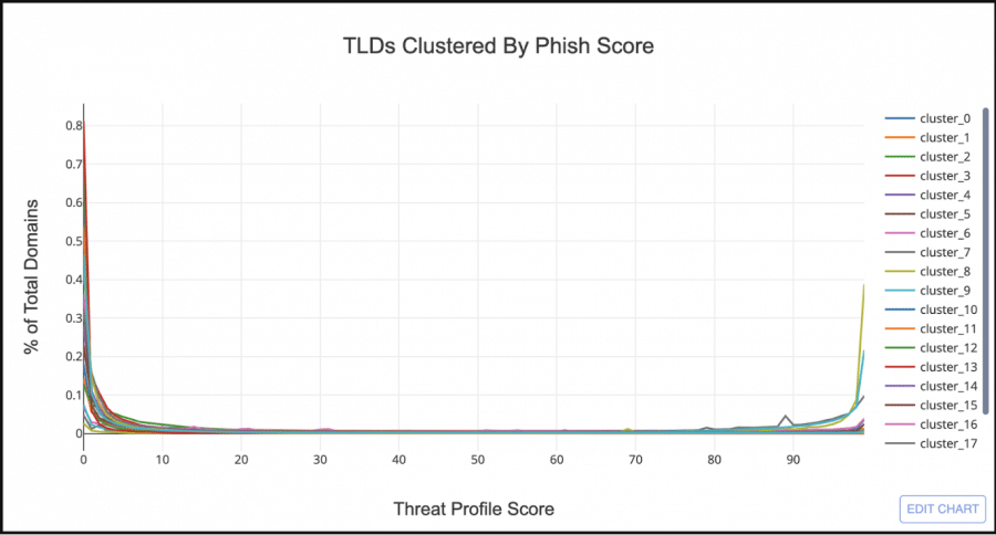
At first glance it looks like the majority of TLD clusters have a similar Threat Profile distribution to .COM. But if you look at the right hand side of the graph there are 3 clusters that look similar to .TK. Let’s filter out all the clusters but the 3 bad looking ones.
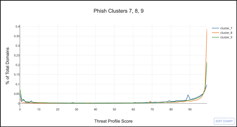
Cluster_8, the orange line, looks very similar to .TK, having very few domains with a low phish score, and the majority with a score greater than 97. Cluster_7, the blue line, shows almost an even split between low and high scored domains, but still sketchy enough that I want to include it as a “Phishy TLD Cluster”.
Note: The source code for this analysis can be found here and includes the TLD data and a Jupyter Lab page with the source code for running the clustering analysis yourself. Play around with the different clustering algorithms and change the number of clusters to see how the TLD clusters change.
Cluster Analysis Results
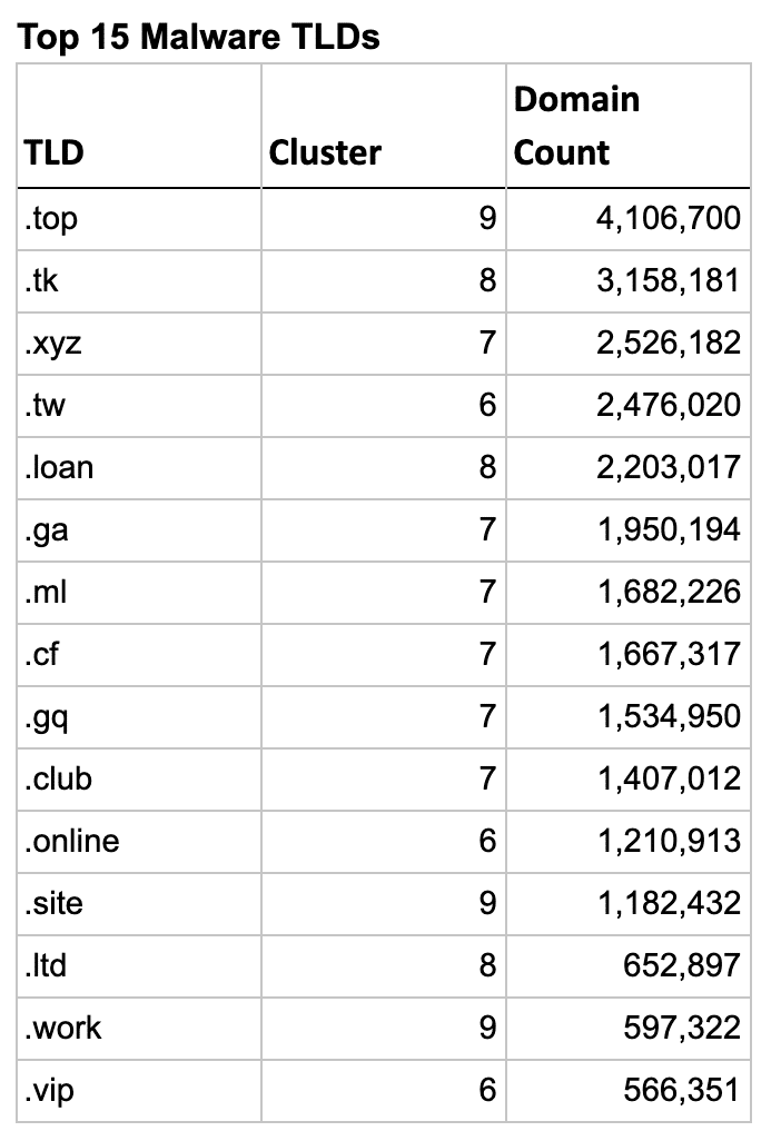
Each Threat Profile type (Phish, Malware, Spam) ended up with 2-4 sketchy looking clusters, but the total number of TLDs in those clusters were quite different. Phish ended up with a total of 31 risky TLDs, while Malware had a much larger list of 54 TLDs. Spam on the other had had a much smaller list, with only 19 total TLDs.
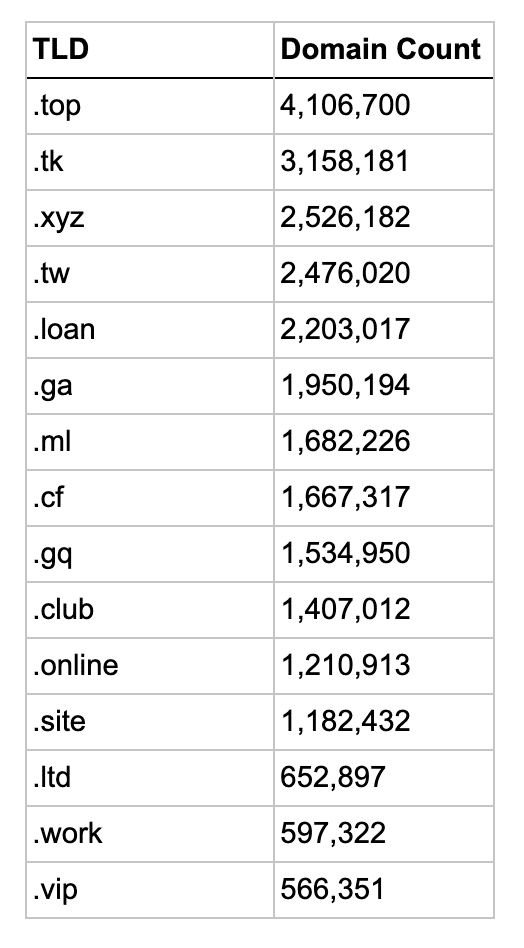
So let’s look at the actual TLDs in these clusters and see how well the clustering algorithm worked. The list below shows the top 15 TLDs for each type, sorted by their domain count.
Interestingly the first 5 phishy TLDs are the 5 free Freenom TLDs, though .GQ and .ML are in a different cluster.
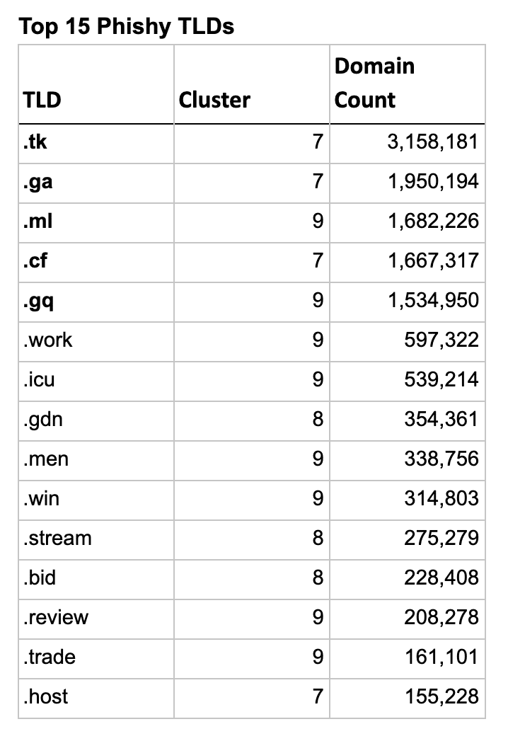
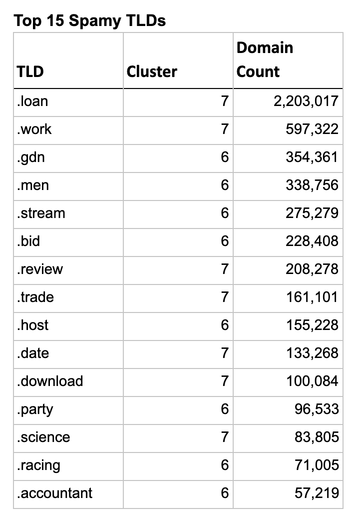
An interesting aside, there were 2 clusters in the spam analysis that were borderline sketchy, but I decided not to include them in the results. If I had, all 5 Freenom TLDs would have jumped to the top of the list, with only .LOAN outranking them due to a higher domain count. You can explore these two clusters at the bottom on the Jupyter Notebook included in the GitHub repo linked above.
TLDR: DomainTools Top Risky TLDs
The full list of TLDs for each of the sketchy clusters can be found at the accompanying GitHub repository in the file tld_clusters.xlsx.
Read more from DomainTools