Creating a Heatmap From SIE Channel 204 Data


1. Introduction
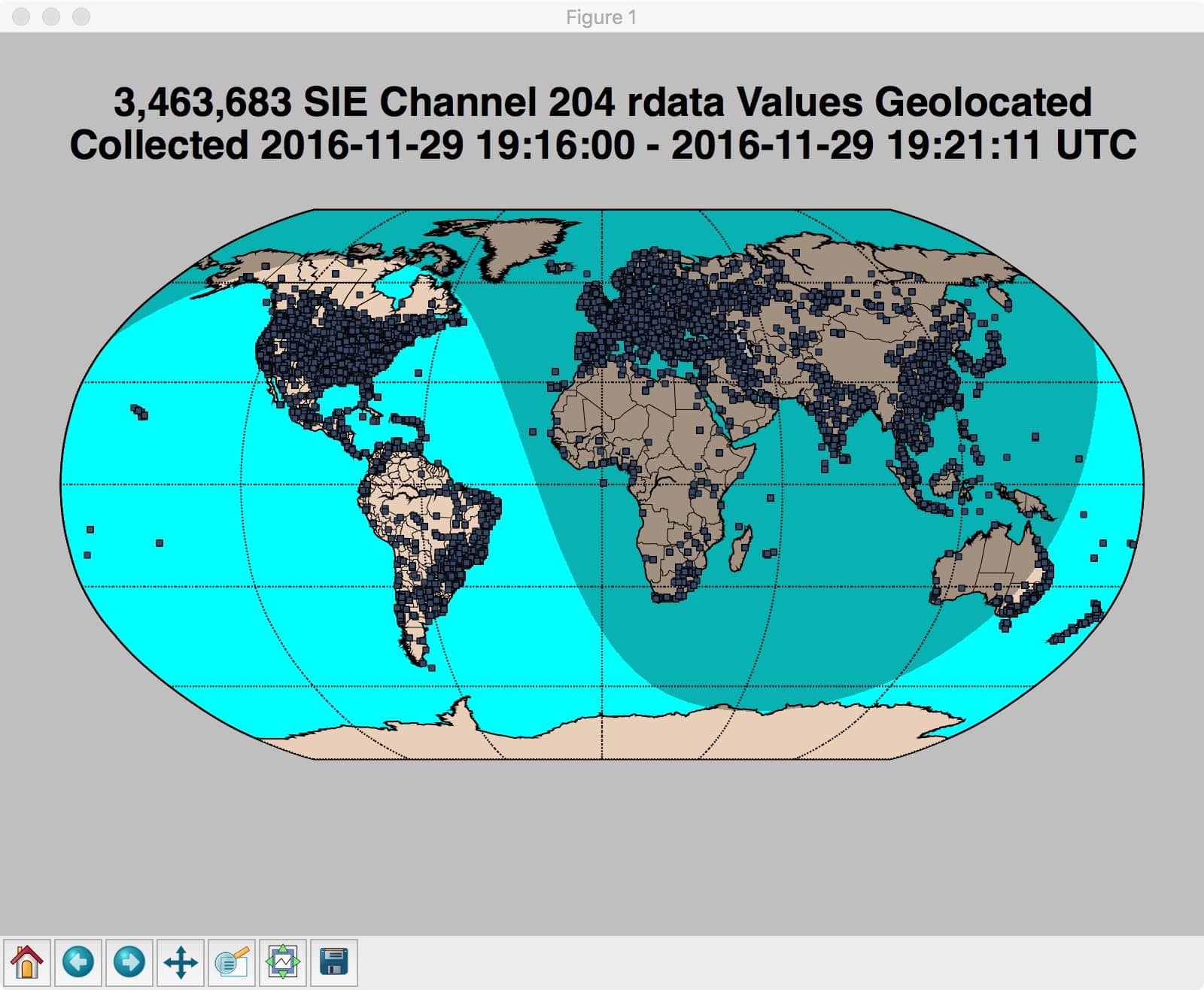
In “Geolocating & Mapping IP Address Data From SIE”, we collected, geolocated andplotted roughly 3.5 million dots on a map of the world.
One thing that quickly became obvious is that it’s hard to interpret that much data on a single plot — you can see that there’s a dense “pile of points” insome regions, but not much beyond that. See Figure 1:
Figure 1. Our Final Map From Last Time
This remains true even if we zoom in 700% on a particular region (such as (in this example illustration) southeastern Australia), see Figure 2.
Figure 2. Southeast Coast of Australia at 7X Magnification

The good news is that there are alternative visualizations you can employ.
For instance, we can try visualizing our data using a “heatmap.” Heatmaps show the most densely visited regions as “hot,” and less heavily visited regions as “cool.”
Heatmaps work best when data is continuous and relatively gradually changing, and less well when data is densely concentrated at a small number of discrete points.
2. Creating a Heatmap with QGIS
Heatmaps are often built using Google Maps. Google Maps, however,can only accomodate a maximum of 10,000 points per map.
Fortunately, there are alternatives, including the free/open source GIS system “QGIS” [pronounced “queue gee eye ess,” NOT “queue jiss”].
QGIS can easily handle the challenge of mapping medium-sized data sets with a few million datapoints.
Because QGIS (like most GIS systems) is a point-and-click GUI program, explaining how to use it requires a combination of screen shots and explanatory text. That may make this post appear long, but in reality, it takes longer to describe the process than to actually do it.
3. Installing QGIS (Including Getting Documentaton For It)
The first step is getting QGIS installed. If you’re using a Mac, the easiest approach is to just grab the prebuilt Mac QGIS installer (and supporting packages).
The installation process is described quite well, so we’ll NOT reiterate those instructions here.
An important point to note: QGIS is a powerful and feature-rich program, BUT that versatility means that learning to use QGIS can initially be somewhatdaunting. If learning-by-example works well for you, you may want to check out some of the tutorials.
Most QGIS users will also want a copy of the “QGIS User’s Guide”.
4. Getting Basemap Data
Once you’ve downloaded and installed QGIS and gotten familiar with its documentation, you’ll also want suitable basemaps, such as the ones from the “Natural Earth” project. For this exercise, go ahead and grab two basemaps:
- http://www.naturalearthdata.com/downloads/50m-cultural-vectors/50m-admin-0-countries-2/ (select “Download countries”)
- http://www.naturalearthdata.com/downloads/50m-cultural-vectors/50m-populated-places/
After downloading those files, move the downloaded zip files into a subdirectory and unzip them (multiple files will be extracted).
5. Running QGIS
After you’ve successfully installed QGIS and gotten the basemap data, you can launch QGIS just like any other Mac application by double clicking the QGIS icon.
You’re now ready to create a new project by going to Project –> New.
Once you’ve done so, you’ll see a new (largely blank) window. See figure 3.
Figure 3. New Blank Project Window
6. Setting The Default Projection for the Project
The earth is obviously a spheroid, while maps are flat. This means that geoinformation needs to be “projected” in order to be appropriately represented on a flat map.
In the first part of this two part series, we used the Robinson Projection. Using that projection is consistent with the recommendations found here.
The choice of the Robinson projection is also an amusing choice given the “XKCD” analysis.
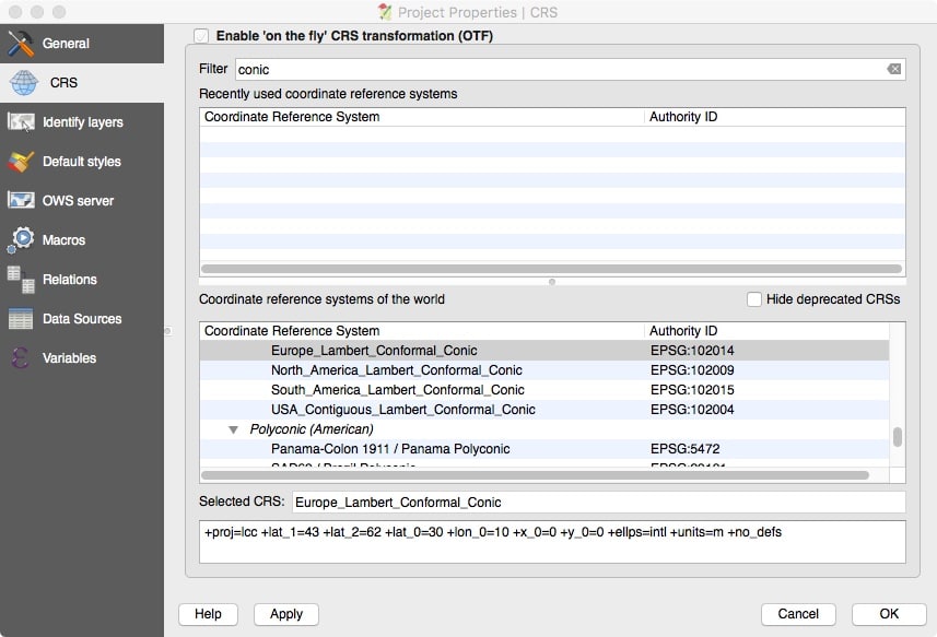
In this second and final part of this two part series, however, we’re going to focus exclusively on Eastern Europe. For this work let’s use the Lambert Conformal Conic projection instead. The Lambert Conformal Conic projection is a projection that’s popular worldwide and well suited to regional maps.
To set the default projection for this project, go toProject –> Project Properties –> CRS and then filter on “conic”(without the quotes). Select Europe_Lambert_Conformal_Conic.
While setting the project’s default projection, be sure to check “Enable on the fly CRS transformation” near the top of the dialog box, too. See Figure 4.
Figure 4. Setting the Default Projection to Europe Lambert Conformal Conic
Click Apply and OK.
7. Now Add A Basemap
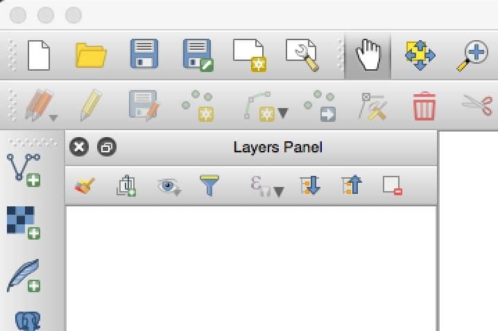
Make sure the Layers Panel is displayed by going to View –> Panels –> Layers Panel. See Figure 5:
Figure 5. The Layers Panel
Add a new vector layer to the project by going to Layer –> Add Layer –> Add Vector Layer. A dialog box will appear as shown in Figure 6:
Figure 6: Dialog Box to Add A Vector Layer
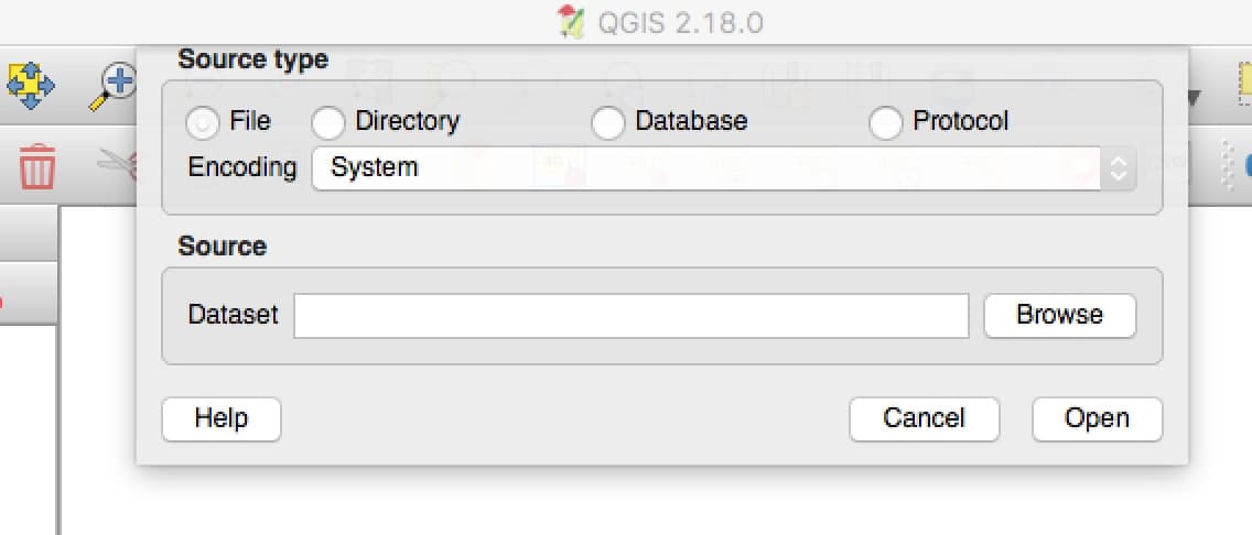
Be sure that the Source Type is “File” and then Browse to the Natural Earth “ne_50m_admin_0_countries.shp” dataset you downloaded and unzipped.
Select that file, then click open. QGIS will then add a layer to the Layers Panel.
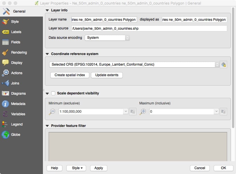
Right click on Ne_50m_admin_0… in the Layers Panel and then come down to Properties. When the Properties dialog displays, click General at the top of the lefthand grey menu area. Verify that the Coordinate Reference System is set to Europe_Lambert_Conformal_Conic, see figure 7:
Figure 7: Layer Properties Dialog Display (General Tab)
Click the “Create spatial index,” button then click Apply and OK. (Creating spatial indicies help accelerate graphical processing.)
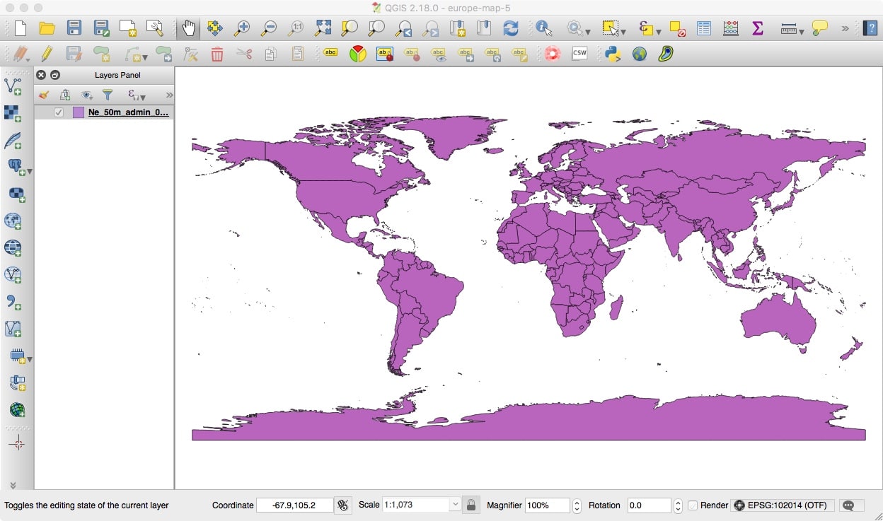
Verify that the magnification (as shown on the bottom window bar) is set to 100%.
Then click View –> Zoom full. This should result in a full world map being shown on screen (the color used to display the map may vary from the purple shown here), see figure 8:
Figure 8. Initial Basemap of the World
8. “Zooming In” On Just Eastern Europe
Our next step is zooming in on just the Eastern Europe region we decided to focus on.
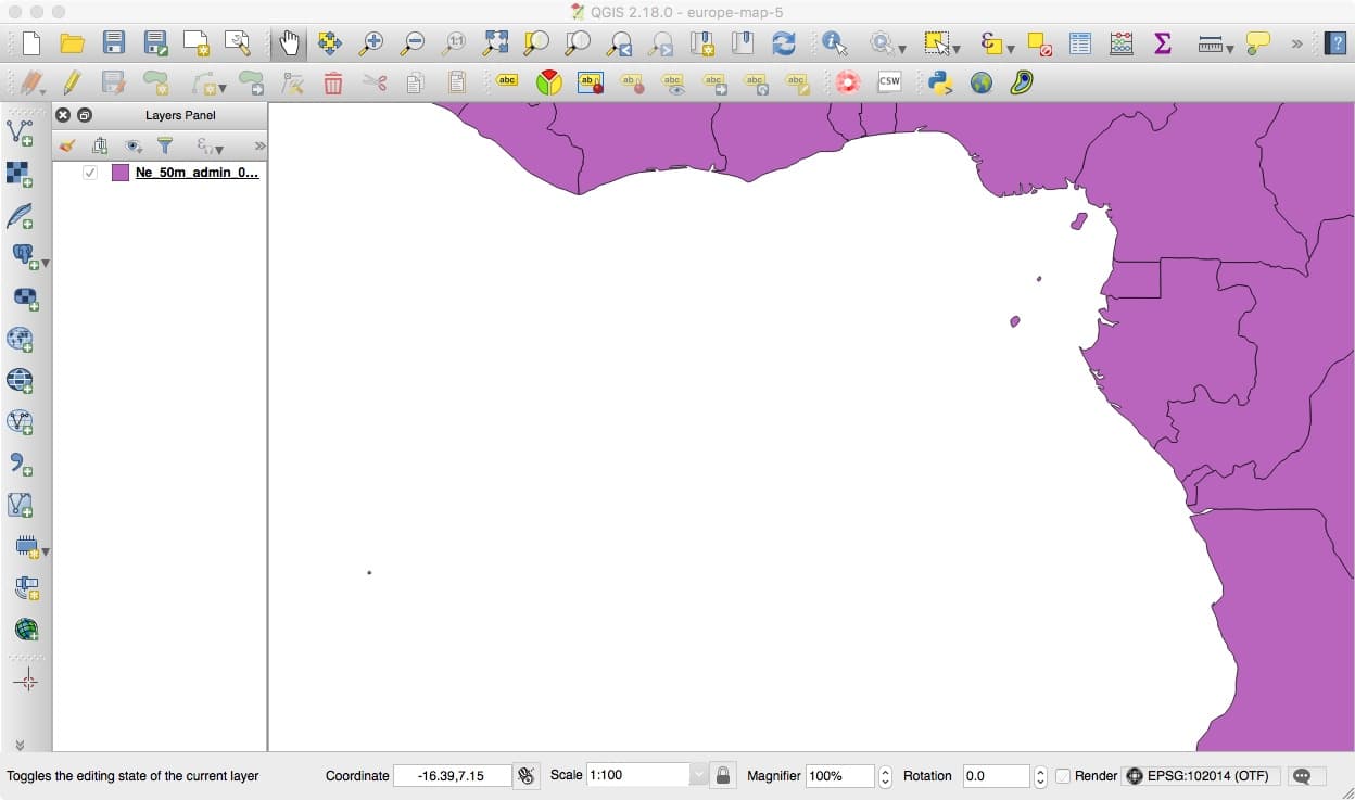
A scale of about 1:100 should be about right, so set the map’s scale to that. You can find the scale-setting control at the bottom of the window. If it seems like it “can’t be changed,” click the little padlock icon next to the scale-setting control — the scale-setting control may have accidentally been locked.
When you reset the scale and magnification of the map, the area initially displayed will likely not be the right one. For example, on our system, we ended up looking at the west coast of Africa, see figure 9:
Figure 9: The West Coast of Africa: A Fascinating Region, But Not What We’re Focusing On Right Now…
You’ll need to drag the map to show the right part of the map inthe viewport. To help those who may be “geographically challenged” find the right region, let’s label the countries.
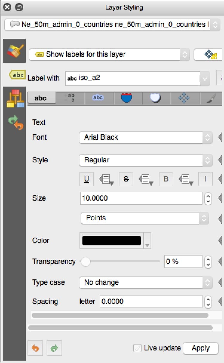
Go to View –> Panels –> Layer Styling.
In the Layer Styling window, select the yellow “ABC” tag in the left hand column of that window. Select “Show labels for this layer.” Set “Label with” to “iso_a2” (those are the normal ISO two letter country codes). Use 10 point Arial Black for the font. See figure 10:
Figure 10. Enabling 2 Letter Country Code Labels in Layer Styling
Click Apply, then close the Layer Styling window.
The result should be a map that now includes country codes. If you’re “playing along at home,” use the “hand” tool from the upper menu bar to adjust the map so that a little corner of Norway can be seen in the upper left corner and Azerbaijan can be seen in the lower right corner. Visually, Figure 11 is what you’re shooting for:
Figure 11. Labeled Basemap of Eastern Europe
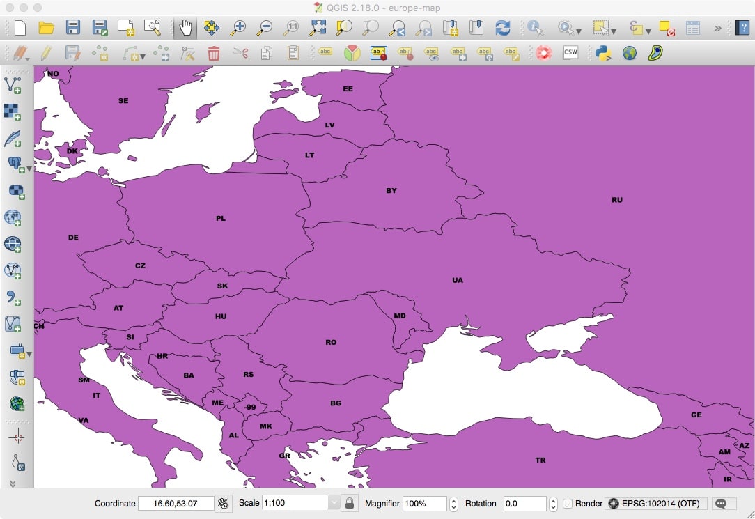
Aside: If you look closely, you may notice that one country is labeled “-99” — that’s the Natural Earth code for “missing data.” Why is one country’s ISO code missing? Simple: Kosovo has yet to be assigned an official two letter ISO country code abbreviation.
Let’s save what we’ve accomplished so far. Do so by going to Project –> Save. If you need to pick a name for your project, try something like sample-map.
9. Cropping Away The Rest of the World
While we’ve focused on Eastern Europe, and viewing Eastern Europe, the rest of the world is “still out there.” (We can see this if we drag our viewport to a different part of the globe)
Let’s actually crop the map to consist of just our region of interest. To truly limit the data we’re working with, we’ll crop both the base map, and then, later, our geolocated IP address data set.
We’ll begin by creating a temporary rectangular clipping mask by going to Layer –> Create Layer –> “New Temporary Scratch Layer…”
The following dialog box will open, see Figure 12.
Figure 12. Creating A New Temporary Scratch Layer for Clipping Purposes
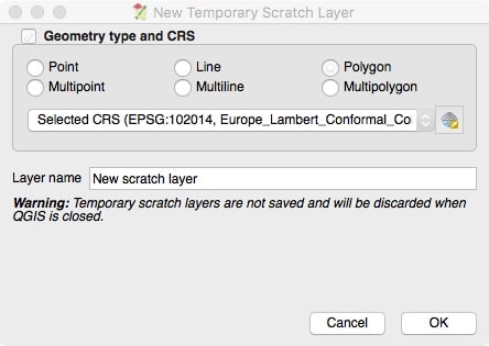
Click the Polygon radio button and make sure that the coordinate reference system is set to Europe_Lambert_Conformal_Conic, as shown in the screenshot above. Click OK.
Now bring up the Layers Panel (View –> Panels –> Layer Panel).
Unselect the base map layer, and select the New scratch layer.Click Edit –> Add Feature.
Your cursor will change to a small crosshair. We’ll now create the rectangular clipping mask:
- Click just inside the upper left corner of the view port.
- Click just inside the upper right corner of the view port.
- Click just inside the lower right corner of the view port.
- RIGHT CLICK on the upper right corner to close the polygon.
Now go to Vector –> Geoprocessing Tools –> Clip. See Figure 13:
Figure 13. Actually Clipping The Basemap
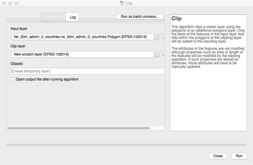
Make sure the Input label points at your base map. Set the Clip layer to point at your scratch layer. Click Run. Your map is now cropped except for the rectangular area you created on the scratch layer.
On the layers panel, unselect the scratch layer and unselect the original map layer, so that only the “Clipped” layer is still selected.
Go to View –> Zoom Full.
You should then see a map that looks like Figure 14:
Figure 14. The Clipped Base Map

Note the quarter inch white border around the lime green map. This margin shows that the map really is clipped.
Save the layer you’ve just created by right clicking on the new layer in the Layers Panel, and then clicking Save As…
- Format should be set to ESRI Shapefile
- Browse to your prefered directory and then enter clipped-euromap
- CRS should be set to Europe_Lambert_Conformal_Conic
That dialog box should look like Figure 15:
Figure 15. Saving The Clipped Country Map
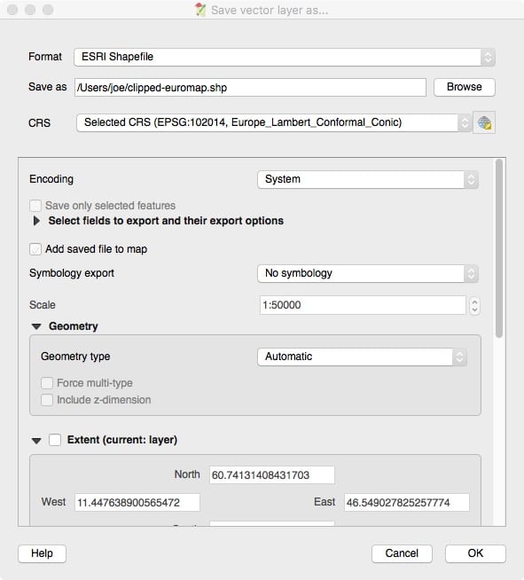
Click OK.
This is also a reasonable point to once again save our work-to-date. Go to Project –> Save.
10. Read In The Geolocated Datapoints
Go to Layer –> Add Layer –> Add Delimeted Text Layer… That will bring up a dialog that looks like Figure 16:
Figure 16. Reading In Our Geolocated Datapoints From Last Time
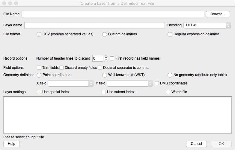
Set the File Name to sie-ips-lat-long-5000000.txt (this is the file we created in the previous blog article).
Make sure the File format is set to CSV.
Set the X field to use field_2.
Set the Y field to use field_1.
Note that this may seem counter-intuitive unless you realize that our (latitude, longitude) data actually encode data in Y, X order.
Make sure “Layer settings” (just above the big white box) has “Use Spatial Index” checked.
Click OK. It will take a minute or two to load the ~3.5 million data points.
You should then see something like Figure 17:
Figure 17. Our Geolocated Datapoints, Plotted (All Around the World At This Point)
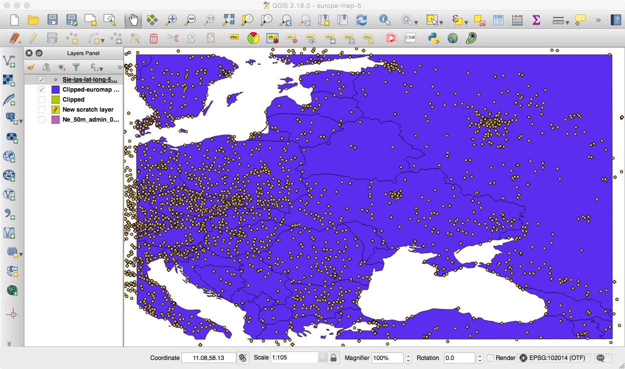
Note that points go beyond the edge of the clipped base map region!
This is our reminder that we need to clip the geolocated points, just as we clipped the basemap. To clip the geolocated points, go to:
Vector –> Geoprocessing Tools –> Clip
Make sure the Input label points at Sie-ips-lat-long-5000000.
Set the Clip layer to point at the scratch layer we previously created in step 9, above.
Click Run.
When we ran the clipping process on a Mac Book Pro with a 3.1 GHz Intel Core i7 and 16GB of memory, it took about 90 minutes of CPU time to do the clipping process. Note that QGIS appears to only use one core for processing clipping requests, even if multiple cores are available and configured for use in the QGIS preferences.
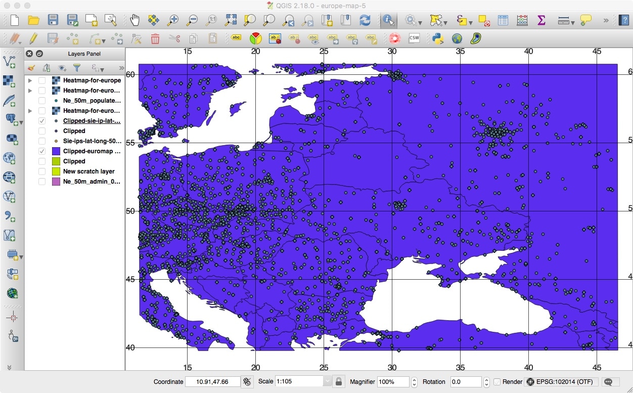
The resulting map looks like Figure 18:
Figure 18. Our Geolocated Points, Clipped To Just Our Region of Interest
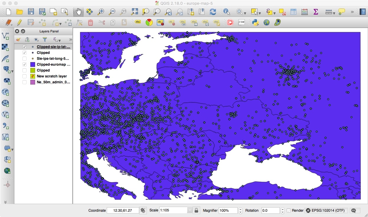
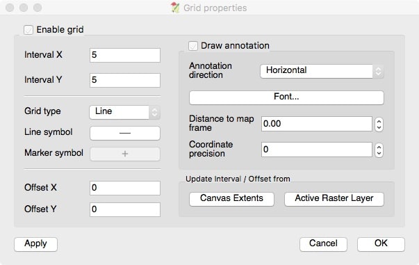
Let’s also add grid markers to the graph. Set the scale to 1:105 to provide a little space around the margins, then go to View –> Decorations –> Grid. In the dialog box that appears, select “Enable grid” and set the X and Y interval to each be 5. Also select “Draw annotation.” See Figure 19:
Figure 19. Adding Latitude and Longitude Lines To Our Map
Click Apply and OK. You should then see a grid on the map that looks like Figure 20:
Figure 20. Our Map, Now With Gridlines
Save that map by going to Project –> Save.
- An Alternative to Clipping Points In QGIS: Selecting Data Outside of QGISThe rectangular grid in the map above reminds us that we could probably have preprocessed our ~3.5 million datapoints outside of QGIS, reading-in only a subset of points from the region of interest into QGIS. This can be far faster than reading in points from all around the globe and then clipping our dataset in QGIS.In order to be able to use the more efficient subsetting approach, we need the (lat,long) coordinates for the region of interest. To get them, we can simply roll the mouse up to the upper left corner, and see (in the reported coordinates on the bottom bar) that the upper left corner of the map is longitude 11.50, latitude 60.73. Rolling the mouse down to the bottom right corner of the map, we can find that location’s coordinates, too — the bottom right corner is longitude 46.58, latitude 39.80.
- A small Fortran program able to do that subsetting is attached to this blog post as Appendix I. Running it on our ~3.5 million pairs of latitudes and longitudes took less than 4 seconds and left us with a subset of 382,619 “in-region” points.
- Having found the appropriate subset of points for the region of interest, we could then read in those 382,619 subsetted points via Layer –> AddLayer –> AddDelimitedTextLayer, just as we did with our original complete dataset.
- Obviously “less than four seconds” is far better than the roughly ninety minutes it took to clip the same set of points using QGIS, but our simplistic little program only does rectangular regions, while QGIS can clip arbitrary polygonal shapes. Use the approach that best meets your needs.
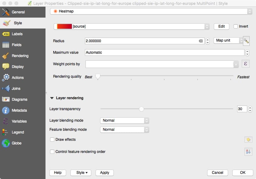
11. Generating The Heatmap
After all the above gyrations, generating the actual heatmap is rather anticlimatic. In the Layers Panel, select the layer that contains our clipped data points. Right click on that layer and select Properties.
In the Layer Properties dialog box that gets displayed, select Style in the lefthand grey menu area. Select “Heatmap” from the top pulldown menu.
Set the Radius to 2.0 Map units.
Set Rendering quality to be whatever you like, Best, Fastest or something in between. Note that choosing “Best” may result in delays of a minute or two when it comes time to compute the heatmap. See Figure 21.
Figure 21. Generating the Heatmap Via Layer Properties
Now let’s edit the color map. Appropriate selection of colors can do a lot for the perceived quality of your heatmap. We’re not artists, but hopefully you can still get the idea based on the colors we’re using.
To edit the color map, click the Edit button on the Heatmap Layer Properties dialog. You should see a new panel popup that looks like figure 22:
Figure 22. Mucking Around With the Heatmap Color Scale
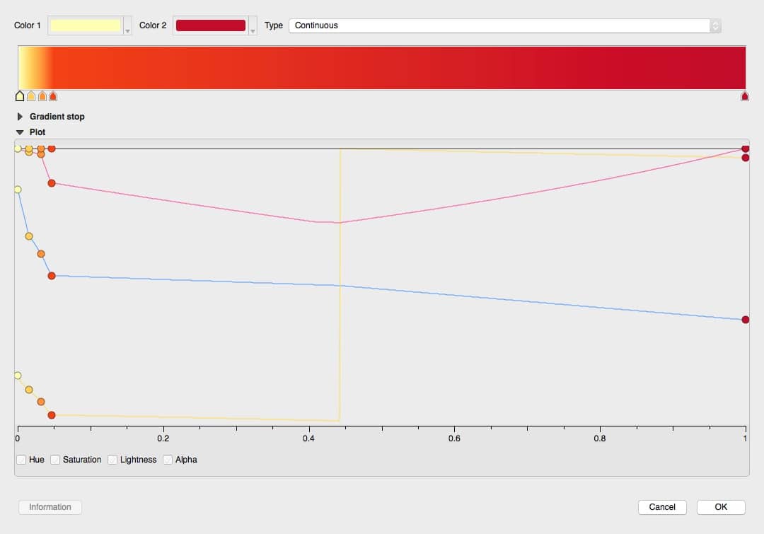
Things to note on this panel:
- Color 1 anchors the left edge of the heat map; you can change it with the little pull down just to the right of the color swatch.
- Color 2 anchors the right edge of the heat map, and can also be changed if desired.
- We’ve set the Type to be Continuous.
- In the color bar that comes just under the two color swatches, you’ll notice that there are five “tags” pointing upwards below the bar, four clumped near the left margin, and one all the way over to the right. Those tags establish the cut points for the color bands used for the heatmap. Because our dataset has mostly sparse datapoints, we create most of our bands at the lower end of the scale.
- If you wanted to create additional bands, double click just under the color bar and a new indicator will be created. You can drag that around to suit your taste.
- The Plot area of the panel graphically shows the Hue, Saturation, Lightness and Alpha values for the cut points. The balls on each of those lines can be dragged to adjust the colors.
Click OK when the color map looks the way you think you want it to be.
Click Apply and OK on the Layer Properties panel. The heatmap will not be computed. This will take a few minutes if you’ve picked “Best” for “Rendering quality,” so be patient.
You should eventually see something like Figure 23.
Figure 23. The (Unlabeled) Heatmap
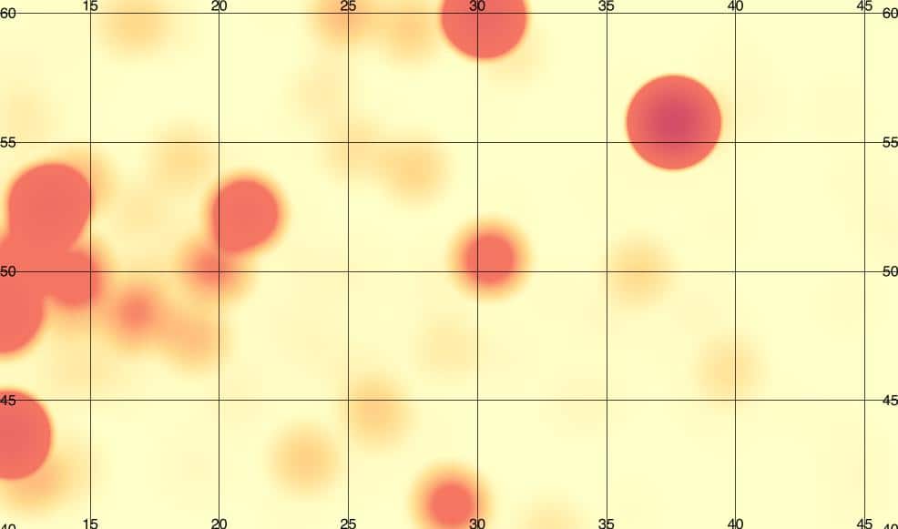
Naturally, you’re probably wondering “What the heck are those hotspots?”
Go to Layer –> Add Layers –> “Add Vector Layer…”.
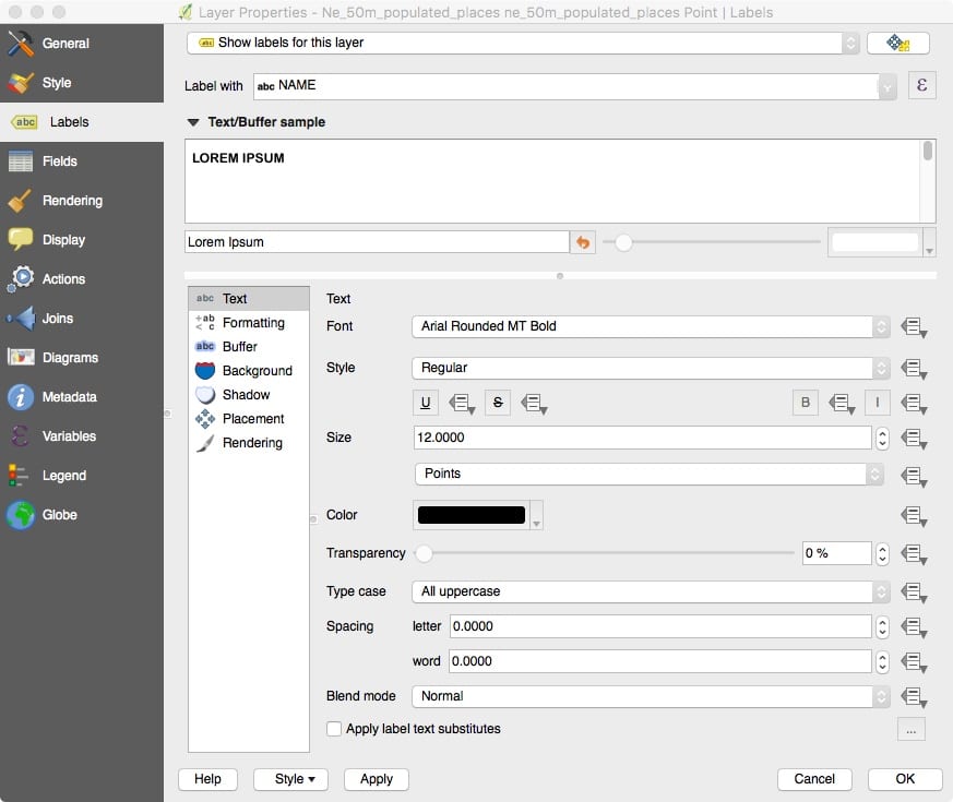
With the “File” button checked, navigate to the ne_50m_populated_places/ne_50m_populated_places.shp dataset and open that file. Right click on that new layer and come down to Properties.
In the grey left hand menu, select the “ABC Labels” tag.
At the top of the panel, select “Show labels for this layer.”
Then select Label With NAME or NAMEASCII
Set the font to be 12 pt Arial Rounded MT Bold or whatever font you prefer.
Set the Typecase to be all uppercase. See figure 24.
Figure 24. Adding City Names As Labels
Click Apply and OK.
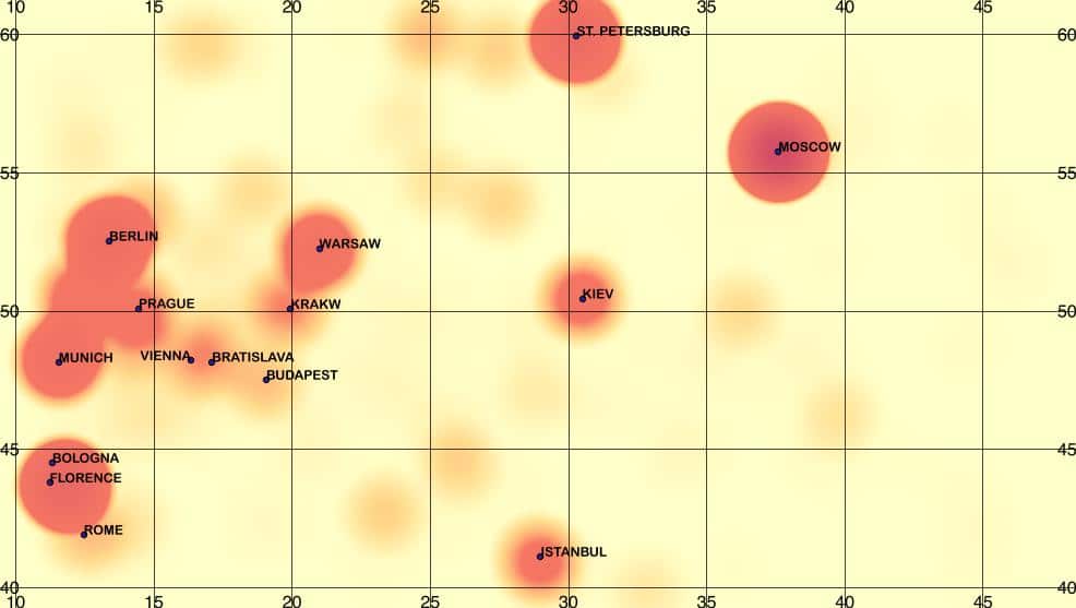
It will take a minute (or perhaps a few minutes, since you ARE putting up labels on points representing cities all around the world!) Eventually you will see city names — LOTS of city names — on your map. See figure 25.
Figure 25. Heatmap With (Too Many!) City Names

Some of those names, like Berlin, Warsaw, St Petersburg, and Moscow, are on top of “hot zones.” We want to keep those labels.Other points, such as Donetsk, Ryazan, Vaasa, etc., can be thinned. To delete those, click on the yellow “Toggle Editing” pencil in the upper left hand corner, see Figure 26:
Figure 26. The Toggle Editing “Pencil” Icon

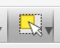
That will let you edit the data. You now need to click on the “select feature” tool from the menu bars, see Figure 27.
Figure 27. The “Select Feature” Icon
You can then delete any unnneeded visible place mames by:
- Clicking on the dot by the unwanted name. The tiny dot will turn yellow.
- Hit the delete key to delete that label.
- Repeat as desired.
You can also hit shift-click repeatedly to select multiple unwanted labels, deleting all the selected labels with a single press of the delete key.
Eventually you should have a heatmap that looks something like Figure 28:
Figure 28. Our Final Labeled Heatmap
If desired, obviously you can turn on display of other layers, such as the country basemap layer or the raw geolocated points layer, too. You may need to tweak the transparency of the various layers to get things to show up with the appropriate intensity.
- Aside:
- We could also explicitly crop those, but we don’t need to do that for this project. We’ll let ourselves be “lazy” and omit showing that non-essential step here, just don’t forget that all those other city names are still out there “live” if you keep working with this sample project!
For now, let’s finish up.
Hit the pencil tool to disable editing. You MUST disableediting before trying to save your project! After you’ve disabled editing, go to Project –> Save. This is the final version of your project. You’ve made it! Congratulations!
After saving your project, go to Project –> Save As Image. This will let you save a JPEG or other graphic copy of your map. This is the deliverable shown in Figure 28.
13. Conclusion
You’ve now seen an example of how you can generate heatmaps from SIE Channel 204 destination IP addresses using the QGIS open source GIS package.
Maybe you’d like to try experimenting a bit with making some QGIS maps of SIE data yourself?
Joe St Sauver, Ph.D. is a Scientist for Farsight and Ben April is Director of Engineering for Farsight.
—Notes:
This site or product includes IP2Location LITE data available from http://lite.ip2location.com.
—
Appendix I. subset-points.f
Note: each of the following lines is actually indented by one tab.
	implicit none

	integer*4 iostatus
	character*20 long1_char, lat1_char, long2_char, lat2_char
	real*4 lat, long, long1, lat1, long2, lat2, minlong, maxlong,
     1	minlat, maxlat

	call getarg(1, long1_char)
	read (long1_char,*) long1

	call getarg(2, lat1_char)
	read (lat1_char,*) lat1

	call getarg(3, long2_char)
	read (long2_char,*) long2

	call getarg(4, lat2_char)
	read (lat2_char,*) lat2

	minlong=min(long1,long2)
	maxlong=max(long1,long2)

	minlat=min(lat1,lat2)
	maxlat=max(lat1,lat2)

	read (*,*,iostat=iostatus) lat, long
	do while (iostatus .ge. 0)

		if ((minlong .le. long) .and. (maxlong .ge. long) .and.
     1		    (minlat .le. lat) .and. (maxlat .ge. lat))
     2		    write (*,*) lat, ",", long
		read (*,*,iostat=iostatus) lat, long
	enddo

	stop
	end
To run that code:
$ gfortran -o subset-points subset-points.f
$ ./subset-points 11.50 60.73  46.58 39.80 < sie-ips-lat-long-5000000.txt > subsetted-ips-lat-long.txt
$ wc -l subsetted-ips-lat-long.txt
  382614 subsetted-ips-lat-long.txt