Year-by-Year TLD Volumetric Data Covering A Decade


1. Introduction
Farsight is pleased to announce the availability of year-by-year volumetric data for over 1500 top-level domains as seen in DNSDB passive DNS, from 2010-2019. To download this report, please click here.
2. What’s Being Reported
Each TLD in this new report has its own graph. A sample graph looks like the following:
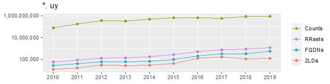
Each graph, including the sample above, has four lines, from top to bottom:
a. Sum of Counts: Each RRset has an associated “count” representing the number of times we saw a cache‐miss query/response pair for that unique RRset. For example:
;; record times: 2020-08-12 00:04:22 .. 2021-01-18 20:04:15 (~159d 19h 59m)
;; count: 2182; bailiwick: farsightsecurity.com.
www.farsightsecurity.com.  AAAA  2620:11c:f008::95

;; record times: 2020-08-11 21:45:46 .. 2021-01-18 23:55:47 (~160d 2h 10m)
;; count: 4934; bailiwick: farsightsecurity.com.
www.farsightsecurity.com.  A  104.244.14.95
Looking at just those couple of RRsets, the “sum of counts” would be 2,182+4,934=7,116. (Most TLDs will have many RRsets to sum up, not just the couple shown here for illustration purposes.)
b. Unique RRsets: DNSDB separately tracks each unique combination of (RRname, RRtype, Bailiwick, Rdata and Zone/Sensor Source). For example, two of many unique RRsets for www.farsightsecurity.com would be:
;; record times: 2020-08-12 00:04:22 .. 2021-01-18 20:04:15 (~159d 19h 59m)
;; count: 2182; bailiwick: farsightsecurity.com.
www.farsightsecurity.com.  AAAA  2620:11c:f008::95

;; record times: 2020-08-11 21:45:46 .. 2021-01-18 23:55:47 (~160d 2h 10m)
;; count: 4934; bailiwick: farsightsecurity.com.
www.farsightsecurity.com.  A  104.244.14.95
Those RRsets are tracked separately because the record types (“A” vs. “AAAA”) and the associated Rdata (“2620:11c:f008::95” and “104.244.14.94”) differ. Other RRsets may differ in other respects, such as having different RRnames, different bailiwicks, or having been collected from sensors vs having been seen in zone file data, etc.
ANY combination of RRname, RRtype, Bailiwick, Rdata and Zone/Sensor Source that differs in ANY way from previously seen combinations will be tracked as a new unique RRset with its own associated “time first seen”, “time last seen”, and “count”.
c. Unique FQDNs (Fully Qualified Domain Names): These are the set of unique RRname values (sometimes simply called “hostnames”). Examples of a few unique RRnames (in this case from the washington.edu domain) include:
biochemistry.washington.edu.
chem.washington.edu.
cis.washington.edu.
climate.washington.edu.
depts.washington.edu.
econ.washington.edu.
Note that each of those domains has a “hostname” part tacked onto the washington.edu delegation point. In our graphs, we report the total number of unique FQDNs within each IANA‐recognized top level domain for each year.
d. Unique Effective 2nd‐Level Domains: These are unique delegation points. Some examples of effective 2nd‐level domains include:
farsightsecurity.com
fsi.io
dnsdb.info
The three examples mentioned above all feature domains registered immediately above a single label top‐level domain, but some domains get registered above an effective top‐level domain that is composed of two or more labels. For example:
- bbc.co.uk is a domain name that was registered above “co.uk” (rather than just above “uk”)
- springfield.k12.or.us is a domain name that was registered above “k12.or.us” (rather than just above “us”)
We look to the Public Suffix List for details about what constitutes an effective top‐level domain.
In the event that you ever forget what line on the graph represents a particular measure, note that the “key” or “legend” on the right matches the four lines on the graph.
3. How The Graphs Are Organized In The Report
The report’s graphs are organized according to the magnitude of the Y axis shown in the graphs. (The top Y axis value may actually be a bit above or a bit below the highest Y value, but as a way of roughly sorting graphs by magnitude, this is a fairly robust approach.) The categories are:
- Hundreds of billions and above (Chapter 3)
- Tens of billions (Chapter 4)
- Billions (Chapter 5)
- Hundreds of millions (Chapter 6)
- Tens of millions (Chapter 7)
- Millions (Chapter 8)
- Hundreds of thousands (and below) (Chapter 9)
- Domains that are revoked/retired (Chapter 10)
- IANA TLDs with no traffic from 6/2010 to 12/2019 (Chapter 11)
If you’re not sure where to find a given domain, note that we’ve provided a hyperlinked index at the back of the report – you can simply click on the page number of an item of interest to jump directly to that specific domain.
4. Limitations/Interpretative Considerations
A number of factors need to be recognized when viewing and interpreting the results in this report, including the following:
- Our Sensor Footprint Is Global, But Not Ubiquitous: While we see a tremendous volume of DNS traffic, and are continually working to improve our sensor coverage, we will never be able to see “all” global DNS traffic. There is a possibility that our passive DNS sensors may NOT have visibility into a particularly exotic TLD that is largely used only in some remote corner of the world where we don’t currently have sensor coverage. We’ve not seen any evidence of issues of this sort, but we acknowledge this potential limitation.
- If you think we’re not seeing representative traffic for your favorite TLD, we’re always happy to work to take traffic from additional locations. If you operate recursive resolvers for an ISP, college or university, large company, government agency or similar outfit, we’d be happy to talk with you about contributing data to DNSDB.
- We Collect Cache Miss Traffic Above Recursive Resolvers, And That Collection Is Impacted By Domain Owner TTL Choices: We intentionally collect passive DNS data in a privacy‐respectful way, via sensors located above participating recursive resolvers. This means that we only see (and index) cache miss traffic, not each individual end‐user’s queries and responses. The cache miss traffic volume we see is obviously influenced by the popularity of each domain, but is also strongly influenced by the TTL (or “time to live”) value set by the domain owner. While we have no reason to believe that there are TLD‐wide TTL patterns that might impact relative data values (for example, we have NO REASON to believe that dot net domains tend to generally have long TTLs while dot org domains tend to generally have short TTLs, or vice versa), TTLs are constantly changing and we’ve not formally studied and excluded this possibility.
- DNSDB Is Actively Curated: Farsight intentionally strives to maintain a good DNSDB signal‐to‐noise ratio – no analyst is happy when their query returns numerous spurious records that are clearly irrelevant to their analysis. Part of that proprietary curation process involves managing domains that are low‐value, privacy sensitive, or otherwise problematic. As an example, we’ve previously discussed sites running VPN‐over‐DNS services (see “RECORD TYPE=NULL Records In DNSDB Mtbl Files“). Those records are either (a) encrypted (and thus of limited use to typical Farsight customers), or (b) not‐encrypted and potentially privacy sensitive, and either way, those records tend to be large and poorly compressible since each RRset is unique/non‐recurring. We do our best to manage those records and similar problematic records when we detect them.
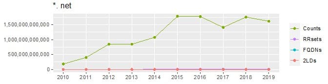
- Please Note That We’re Showing Log‐Linear Graphs The bulk of this report consists of graphs. Because of their central role in this document, we want to make sure you interpret them correctly. In particular, because there’s a large range of values being reported, each graph has a logarithmic Y axis.
- To see the problem if we DON’T use a logarithmic Y axis, compare the data for the dot net TLD when plotted on a linear axis vs a log‐linear axis:
- Normal (Linear) Y Axis
- Log Y Axis
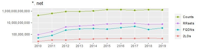
- When you look at the linear plot, you may think that we’ve “forgotten” or “overlooked” two of the lines. Not so. All four lines were drawn, but due to the extreme scale of the “sum of counts”, the other three lines were draw “right on top of each other” with only the last being visible (and none of the three exhibiting discernible variation). Now you see why we need logged Y axes!
- When looking at data plotted on a logged Y axis, remember that even seemingly small increases or decreases can translate to big changes.
- We’re Showing Yearly Counts When many of the graphs are monotonically increasing, you may forget that each point represents a YEARLY value – these values are NOT cumulative. The values for 2016, for example, are NOT based on 2015 plus some increment. The values for each year are computed on their own/in their own right.
- We’re Combining All Domains Within Each TLD Each graph is reflecting the aggregate of all the domains under that TLD. The extreme activity of one delegation point within a TLD may be implicitly “buffered” or “washed out” by low activity from dozens of other domains in some cases.
5. What Does It All Mean? What Can We See In These Graphs?
We want to encourage you to look at the report for yourself, but just to give you a few ideas of what you’ll see:
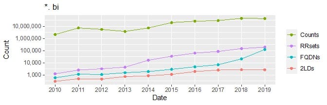
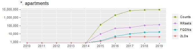
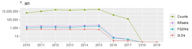
- When Did A Domain Start/Stop Being Used? Was the domain in operation before the middle of 2010, or is it a domain that became active some time after that? Was the domain still active as of the end of 2019? Let’s contrast dot “bi” (Burundi) vs. dot “apartments” vs. dot “an” (formerly the Netherland Antillies):
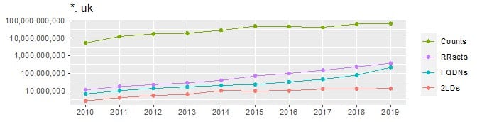
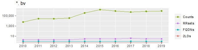
- Relative Size: You can get a sense of the relative “magnitude” of the various TLDs by looking at the volumes associated with each domain. Compare, for example, dot “uk” (the domain for the United Kingdom) with dot “bv” (the domain for Bouvet Island, an uninhabited subantarctic island that’s a dependency of Norway). Looking at the scale of the Y axis, it’s obvious which is larger:
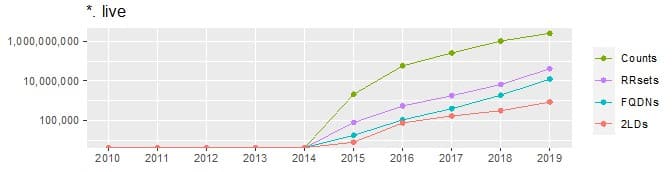
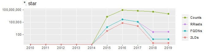
- How Is The Domain Changing? You can tell how domain usage is evolving – does it continue to grow over time, or has it been level, or has it even declined? Compare the 2LDs for dot “live” vs. dot “star”:
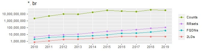
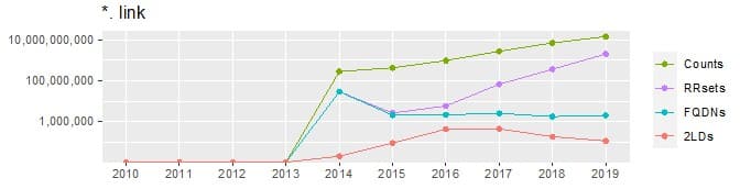
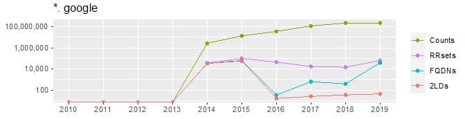
- Ratio of Unique 2LDs to Unique FQDNs to RRsets to Cache Miss Counts Are the four lines consistently roughly parallel? Or do the lines have varying slopes? Compare dot “br” vs dot “link” vs dot “google”:
6. How Does This Report Relate to The Earlier May 2021 “Decadely” Report?
The earlier published report, “A Decade of Passive DNS: A Snapshot of Top-Level Domain Traffic” worked with the same four measures as this report, but differs from the current report in significant ways:
- The earlier report was aggregated over the entire decade, and reported results in tabular form. It also included a breakdown by RRtype.
- This new report complements the earlier report, and responds to user feedback asking for a year-by-year graphical breakdown of values over the decade.
We hope both reports provide interesting insights for those interested in all things TLD-related.